Skip to content
Learning paths
Challenges
Solutions
Articles
Unlock Pro
Log in with GitHub
Profile
Overview
Solutions
5
Comments
2
William Delanoy
@wdelanoy
Follow
All solutions
Submitted about 1 year ago
Responsive Grid Testimonials Section
HTML
CSS
0
6
0
Submitted about 1 year ago
Responsive 4-Card Feature Section w/ Grid
HTML
CSS
0
2
0
Submitted about 1 year ago
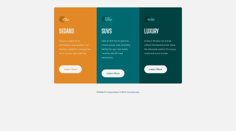
Responsive 3 Column Preview Card - Hover Effect, Media Query
HTML
CSS
1
5
0
Submitted about 1 year ago
Responsive Product Card Using a Media Query, Pseudo Element, Hover FX
HTML
CSS
0
5
0
Submitted about 1 year ago
Responsive QR Code Using Flexbox and Media Query
HTML
CSS
0
7
0
