Not Found
Not Found
Not Found
Not Found
Not Found
Not Found
Not Found
Not Found
Not Found
Not Found
Not Found
Not Found
Not Found
Not Found
Not Found
Not Found
Not Found
Not Found
Not Found
Not Found

All comments

  • Talasa 130

    @TalasaDev

    Submitted

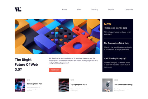
    Hello everyone, I just finished this project.

    I had a really hard time figuring out how to create the darkening effect in the site when the hamburger menu is open. I tried creating a <div class="shadow"> and then:

    • place in the after the <main> as <div class="shadow"></div> and give through CSS size, position, background-color, and then apply a blend-mode with multiply and transparency. I wanted to place over the main container another empty container of same size with only a transparent dark color that would display only when clicking the '.openMenu'. It didn't work and I sensed like my own computer was judging me. It was wear.

    • the second option I tried was, in mobile display, to add a second column in the '.navbar' element and style it with a dark color and transparency.

            <logo>    
             <div>  
                **// right here I place the <div class="shadow></div>**
                 <ul class="navbar">            
                     <li>Home</li>
                     <li>New</li>
                     <li>Popular</li>
                     <li>Trending</li>
                     <li>Categories</li>            
                 </ul>          
            </div>        
            <burger-menu>                
          </nav>```
    
     Could somebody provide any orientation on how to get that effect? 
    
    Thank you,
    happy codding!!
    

    @victoribironke

    Posted

    You can try using the box shadow property. box-shadow: 0px 0px 1000px 5px black;. It will create a shadow all around the parent with the color you set. You can reduce the 1000px if it is too much.

    0
  • Mishael 60

    @mishael-codehq

    Submitted

    the main problem I had was switching the blog post image according to the screen sizes because the "srcset" HTML attribute didn't work on my machine.

    @victoribironke

    Posted

    Hi, your work is clean, good job. For changing the blog post image, you can try using the background image property. background-image: url('path-to-the-image');, or have two separate divs for the two screen sizes, then set a display: none; to the one you don't need in the media query. I like the second one better. The header's list items shouldn't spread out as the page's width increases, the "New" section could use a bit of work and I saw some typos but overall, good job.

    Marked as helpful

    1
  • @victoribironke

    Posted

    Hi, your work is clean, but the breaking points for your responsiveness and the overall responsiveness could be worked on. You also didn't add all the images for the last section.

    0
  • @victoribironke

    Posted

    Hi Stephen. Your website looks really good, but you didn't make it responsive.

    0