@WarishaRidima2010Submitted almost 2 years ago
ubonisrael
@ubonisraelAll comments
- @ubonisraelPosted almost 2 years ago
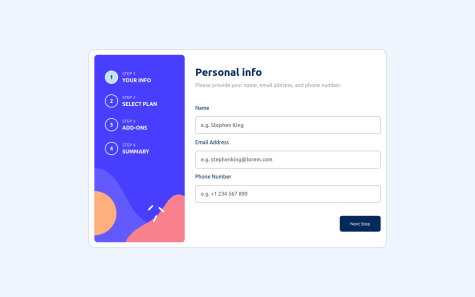
- Navigation buttons and add ons don't have a hover effect.
- Layout isn't responsive (step 1 and 2 ) on mobile view, I think this is because you've fixed the bottom container to the bottom of the page, your other containers aren't aware of this which causes the overlap, an approach would be to set the height of the app container to remaining space and set overflow to auto e.g.
<div class= 'parent'>
<div class='child'>
<div class='grandchild'></div>
<div class='fixed grandchild'></div>
</div>
.parent { width:100%; height:100%; } .child { position: relative; height: calc(100% - 10rem); /* 10rem == height of fixed div */ } .fixed { position: fixed; bottom: 0; left: 0; height: 10rem; }The step indicators don't select as indicated in the design but I kinda like your style. Ultimately, you did a good job and I hope you found my suggestions helpful.
Marked as helpful0
