@mayurDayal2000Submitted almost 3 years ago

therealalexolthoff
@therealalexolthoffAll comments
- @therealalexolthoffPosted 4 months ago
Hey Mayur!
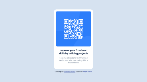
Well done. I really liked checking out your CSS, using grid made it much easier to understand how you achieved the centering of the card, I think I'll make some edits to my project in the future to use that, less confusing than flexbox.
I liked also that you managed to exclusively use semantic HTML and kept most of your stuff inside your main tag.
That said, your attribution tag could perhaps be put in a footer anchored to the bottom of the page, which would be more in line with the design.
Beyond that, I think the only other thing I would do differently (others may disagree) is use more classes instead of descendent selectors. Just because that way it's easier to reuse them in case you end up expanding the project. Again, others might disagree, and I could also be wrong about this being best practice, but using classes just seems like an easier way to organize CSS.
All in all, great job!
Marked as helpful1