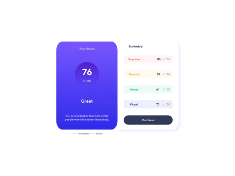
I tried to center my attribution content to the center of the desktop layout, but know my [display:grid] columns were conflicting with my usual approach. If you have any suggestions on how you'd have done this, I'm all ears. Thanks.
smahidv
@smahidvAll comments
- @GrowingHermit44Submitted about 1 year ago@smahidvPosted about 1 year ago
add a <footer>// move your attribution here </footer>
if you keep it inside the main it will normally follow the grid behaviourMarked as helpful1 - @mikatechsSubmitted about 1 year ago
- Could not figure out why profile image is not 100% visible as provided in design files.
- Could not determine the best practice approach for background images regarding responsiveness.
@smahidvPosted about 1 year agoadd { background-size : cover} to make the image 100% visible .
1 - @orazdaurenovSubmitted about 1 year ago
Here's my version for the task requested. I've used all my knowledge available to make it look as close as the given design.
One thing that I little bit struggled for the desktop version, I can't set the needed version of the imagine for desktop version, I appreciate your advices on how i can improve it and serve the right version of the image. Another thing, for the desktop version the content side, should i set width/min-width to this container ? because I've tried different versions to match the design, unfortunately I'm doing smth wrong, because can't reach what i want.
As for the button in the desktop version, got some issue on laying the cart icon and the text in one line, what do i have to set so they can align together ?
Highly appreciate your suggesyions !!
@smahidvPosted about 1 year agoIn the desktop version, both the image and content share equal space in the container. To make it responsive, it's best to use CSS Grid like this:
.container { display: grid; grid-template-columns: 1fr 1fr; } This gives better control compared to using flex
Marked as helpful0 - @Saad-HishamSubmitted about 1 year ago
Hi there 🙋♂️ i really enjoyed solving this feedbacks are more than welcome
@smahidvPosted about 1 year agoyou did a really good job .keep up the good work ! I've question though ,did you use just css in animation
1 - @JoaoVitor-BispoSubmitted about 1 year ago


