shadazls
@shadazlsAll solutions
- Submitted 8 months ago
Advice generator app
- HTML
- CSS
- JS
- API
I would really like to get help about the position of the dice button !
- Submitted 8 months ago
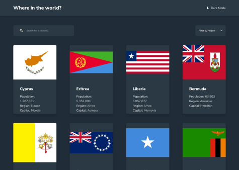
REST Countries API using TailwindCSS
- HTML
- CSS
- JS
- API
I don't really know, I think I did most of the things correctly but if you have suggestions I would be happy to hear them.
- Submitted 8 months ago
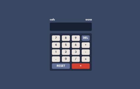
Calculator app
- HTML
- CSS
- JS
I would like to get help about the switch with 3 positions and responsiveness.
- Submitted 8 months ago
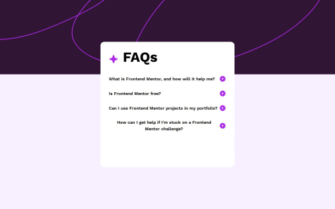
FAQ Accordion TailwindCSS
- HTML
- CSS
- JS
Probably about JavaScript animation when the text appears.
- Submitted 8 months ago
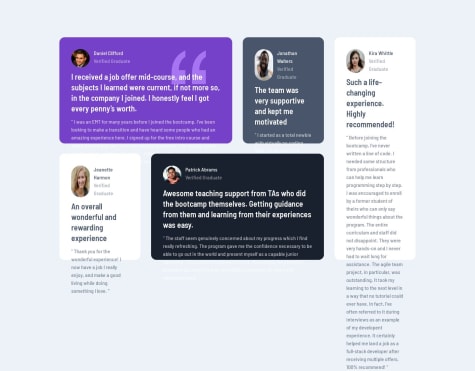
Testimonials grid section with TailwindCSS
- HTML
- CSS
I would like to get help with responsiveness in TailwindCSS.
- Submitted 8 months ago
Four card feature section
- HTML
- CSS
I would like help mainly with grid, but also with the quality of my code. Generally speaking, I would not say no to any help to improve.
- Submitted 8 months ago
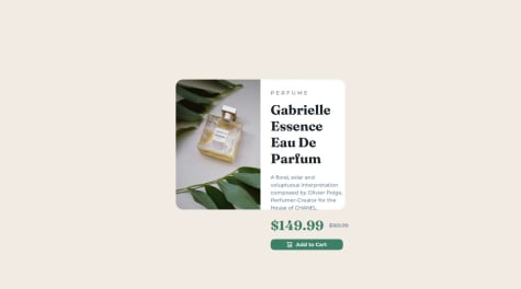
Product preview card component
- HTML
- CSS
I would like help with responsiveness mainly but I'm open to any suggestions.
- Submitted 8 months ago
Recipe page
- HTML
- CSS
I would like help with the following specific areas of my project:
Adding horizontal lines between elements, especially within tables. Implementing page scrolling to ensure proper navigation and visibility of content. Styling list bullet points and customizing their appearance. Improving the quality of my code.
- Submitted 8 months ago
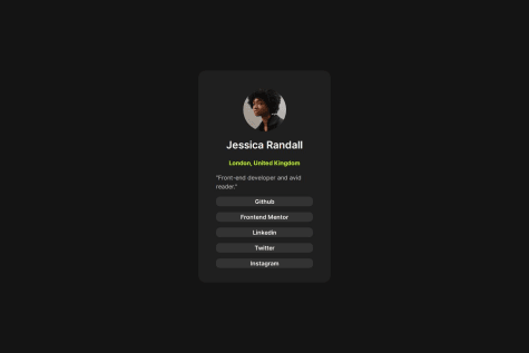
Social links profile
- HTML
- CSS
I'd appreciate assistance with utilizing Bootstrap effectively, creating hover effects, and implementing click interactions.
- Submitted 8 months ago
Blog preview card
- HTML
- CSS
I would appreciate assistance with responsive design and utilizing flexbox effectively.
- Submitted 8 months ago
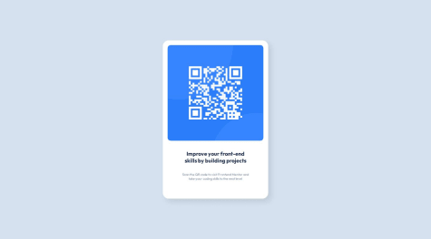
QR code component
- HTML
- CSS
In the documents of the project, it says that the font-size of the title is 22px, and of the paragraph is 15px but I don't have the same final visual as in the design, probably because my computer isn't the same size as the one of the design. How could I overcome that, should I use % or rem or something else instead of px ? Also, I think my box-shadow isn't perfect, if someone can help with that.