Not Found
Not Found
Not Found
Not Found
Not Found
Not Found
Not Found
Not Found
Not Found
Not Found
Not Found
Not Found
Not Found
Not Found
Not Found
Not Found
Not Found
Not Found
Not Found
Not Found

All comments

  • Ishmaelβ€’ 330

    @Ishmaelsealey

    Submitted

    Hi. 
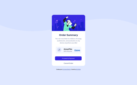
My question is about the border-radius: ; aspect of the section. I tried putting the border-radius: 5px; on the container of the entire section, but that didn't work.

    To resolve that I went ahead and made each section have a separate border and change that using a media query for desktop screens.

    While this works fine, my issue with this is that it's repetitive and would be more intuitive if I could put the border on the containing section.

    Any comments on what I could do will be appreciated :D

    BadTβ€’ 230

    @saodinh

    Posted

    You can set the <main> element {border-radius: 5px ; overflow: hidden}. The overflow hidden is what you are looking for here.

    Marked as helpful

    1
  • @catherineisonline

    Submitted

    Hello, Frontend Mentor community! This is my solution to the Huddle landing page with a single introductory section.

    I have read all the feedback on this project and improved my code. Due to the fact that I published this project very long ago, I am no longer updating it and changing its status to Public Archive on my Github.

    You are still free to download or use the code for reference in your projects but I longer update it or accept any feedback.

    Thank you

    BadTβ€’ 230

    @saodinh

    Posted

    You did a great job, though some things can be improved. Since the "Register" button is actually a link to the register page and doesn't belong in a form , you should use <a> tag for it. The three social icons should be wrapped in <a> tags as well (because they are also links to the social media pages).

    0
  • @catherineisonline

    Submitted

    Hello, Frontend Mentor community! This is my solution to the 3-column preview card component.

    I have read all the feedback and tried to update my code accordingly. Due to the fact that I published this project very long ago, I am no longer updating it and changing its status to Public Archive on my Github.

    You are free to download or use the code for reference in your projects, but I no longer update it or accept any feedback.

    Thank you

    BadTβ€’ 230

    @saodinh

    Posted

    Those "learn more" buttons are actually links, so you got to use <a> tags for those.

    1
  • Niti Mittalβ€’ 260

    @NitiMittal

    Submitted

    This is my third challenge and I build this with my own knowledge realted to HTML and CSS flexbox. Your feedback will be highly appreciated regarding the responsive deisgn of my webpage.

    BadTβ€’ 230

    @saodinh

    Posted

    It looks great. One thing though, your links and buttons should have a hover and focus state.

    0
  • P

    @outerpreneur

    Submitted

    Hi! Im back at it after the break!

    here is my solution to this challenge. Im starting to do some more effort into responsiveness.

    For this challenge, I don't know how to make the image adapt to the size of the screen of a smaller device. Any ideas?

    I also struggle with the fontawesome icons. For some reason, they don't appear on my project. I have added the stylesheet and the CDN address.

    BadTβ€’ 230

    @saodinh

    Posted

    About the font-awesome icon, trying changing the 'href' to this link instead "https://cdnjs.cloudflare.com/ajax/libs/font-awesome/6.0.0-beta3/css/all.min.css".

    Marked as helpful

    0
  • BadTβ€’ 230

    @saodinh

    Posted

    Oh, I didn't know that, thanks. I'll fix it

    0