Ruben
@rugarcia25All comments
- @Eyu-GenSubmitted about 1 year ago@rugarcia25Posted about 1 year ago
You should try to hit better the colors, anyways, good job. I'm a beginner so, not much i can teach you hehe
0 - @ParthUONSubmitted about 1 year agoWhat are you most proud of, and what would you do differently next time?
I take pride in completing a recent HTML and CSS challenge using grid layout. For future challenges, I aim to enhance responsiveness and explore more advanced styling techniques.
What challenges did you encounter, and how did you overcome them?I faced a challenge in aligning cards 1 and 4 vertically. To overcome this, I utilized the transform: translateY property to shift them into the desired position, ensuring proper alignment within the layout.
What specific areas of your project would you like help with?Animation and parallx effect
- @Mali-beeSubmitted about 1 year agoWhat are you most proud of, and what would you do differently next time?
another fun little CSS challenge, I think it's time to start taking on harder challenges💪🏾
What challenges did you encounter, and how did you overcome them?Was struggling to get the right exact font style. Any feedback would be appreciated.
What specific areas of your project would you like help with?Any feedback is welcome.
@rugarcia25Posted about 1 year agoYou should import the fonts at the begininng from any source, i like to use Google Fonts.
@import url('...');
0 - @tondevpySubmitted about 1 year ago@rugarcia25Posted about 1 year ago
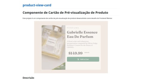
You should try to align the price "$169.99" with the price in offert
0 - @RidloGhifarySubmitted about 1 year agoWhat are you most proud of, and what would you do differently next time?
i need more challenging project :)
What challenges did you encounter, and how did you overcome them?i am a bit confusing for how to styling dot on li element and also how add a margin between the dot and the text, but i`ve figured it out
What specific areas of your project would you like help with?i`ll help more about styling css
- @rembiszkacperSubmitted about 1 year agoWhat are you most proud of, and what would you do differently next time?
I did it myself so I can be proud
What challenges did you encounter, and how did you overcome them?I had no problem at all
What specific areas of your project would you like help with?I dunno
@rugarcia25Posted about 1 year agoWhen hovering over social media, the cursor must be a pointer.
Very good work!
1 - @rembiszkacperSubmitted about 1 year agoWhat are you most proud of, and what would you do differently next time?
I'm glad I could practically do this challenge myself, I don't know what I could do differently in the future
What challenges did you encounter, and how did you overcome them?I had a slight problem with adapting the elements to the page, but the rest went ok
What specific areas of your project would you like help with?I need to learn the elements of the website and its responsiveness
@rugarcia25Posted about 1 year agoCSS:
h2 { font-weight: 800; font-size: 24px; }
h2:hover { color: hsl(47, 88%, 63%); }
You should always try to respect the hierarchy of tags to maintain correct semantics. In this case, you should change the h2 to h1 and adjust the font size.
As an aside, if you look at the image of the active stats, when you hover over the title, the cursor changes, so it should be as follows:
h1:hover { color: hsl(47, 88%, 63%); cursor: pointer; }
I hope I've helped!
Marked as helpful1 - @Manith112Submitted about 1 year agoWhat are you most proud of, and what would you do differently next time?
good website provide many project to do
What challenges did you encounter, and how did you overcome them?mostly from intermediate challenges , i can breakthrough it by my brain
What specific areas of your project would you like help with?no need
- @rugarcia25Submitted about 1 year ago@rugarcia25Posted about 1 year ago
I don't know why the screenshoot isn't correct... It happens to me almost in every project...
0


