@pudding-shark

Niels
@nielsfechtelAll comments
- @nielsfechtel
Nice design, looks good!
- I don't know how to properly use classes. As in, maybe I made too many classes and that I could have achieved this without some of them.
I like the way you added those classes, e.g. small-weight, mid-weight etc. - they're utility classes like TailwindCSS uses, I recommend you look it up if you don't know it. A pretty common CSS design pattern I'd say.
- I also want to know why my solution is smaller compared to the design. I felt like it's an easy fix but for some reason I can't figure it out
I think that's just small things adding up, e.g. the image is bigger, and the spacing between elements as well as padding is bigger.
- @G-GakiiWhat are you most proud of, and what would you do differently next time?
build a project with grid
What challenges did you encounter, and how did you overcome them?Making the content of Grid item fill the item
What specific areas of your project would you like help with?How to make the content of grid item stretch to fill the grid item
@nielsfechtelText is a bit off, but the layout looks great
- P@MsadafK@nielsfechtel
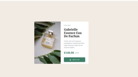
nice job! I feel like maybe the images in the cards aren't aligned to the bottom, while the headline and content are aligned to the top - instead all three are centered in the card. In the original design, the image is in the bottom-right corner of every card.
- @Dayerlling05@nielsfechtel
Nice work! One thing I noticed is like how on the auto-generated solution-screenshot, the button is very far from the bottom of the container. This could be solved with
justify-content: space-between. The button's font also is the other one.In the media queries, why did you copy all your css into both? Unless you changed all the values in there, I think it's enough to just add the selectors and attributes that one wants to actually change.
- @Bartek20What specific areas of your project would you like help with?
- I need help with increasing spacing between bullet points / numbers (:marker) in lists (ul / ol).
@nielsfechtelLooks great! Regarding bullet point-spacing, what worked for me was
padding-inline-start: ...;on the<li>s.Marked as helpful - @MachoCamacho1What are you most proud of, and what would you do differently next time?
I managed to add a different font color when it comes to anchors. I had never done it before and it was a good challenge.
What challenges did you encounter, and how did you overcome them?Changing the font text on anchor elements while hovering. A bit of research managed to help me out.
@nielsfechtelLooks good, just the green is a bit different. There's the exact color(s) in the style-guide.md-file, in the downloadable assets, if you're looking for that. I personally just add all colors in that document as CSS-variables each challenge I start, same as fonts and font-weights etc, that way I can use them as I build the site, quite handy.
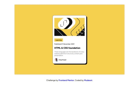
- @Mudassir-Coder@nielsfechtel
Looks good! The Readme is broken, though.
- P@tmen670What challenges did you encounter, and how did you overcome them?
I was struggling to center the container in the middle of the webpage. I used flexbox and justified the content to the center, but upon using the align-items attribute, my container remained at the top of the page. Using my browser's inspect element, I noticed that my body was not taking up the height of the whole webpage, but only the height of my container. I added the height:100vh to the body, which made it take the entire height space of the webpage. This enabled the align-items:center to work correctly, thus placing my container at the very center of the webpage.
@nielsfechtelLooks good, the container quite small on my screen though, maybe 25% of screen-height. I personally like using display: grid; and place-items:center for general centering, one line less :D