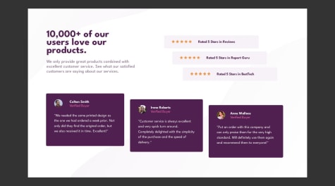
Would love feedback on how to improve. Thanks!
Brian Ndickers
@ndickersAll comments
- @jclegg31Submitted about 1 year ago
- @FrantiskaAliSubmitted over 1 year ago
This is challenge I actually finished a while ago but didnt get to upload it yet .:)
@ndickersPosted over 1 year agoNice trial but i've got some few remarks. First give your articles maximum-width, to prevent increase in width size as the screen size increases. Second, avoid naming your classes and ids as "#A, .B, #C", instead give them relative names such as "main-heading", so that some one can easily understand where specific class comes from. Third, format your code for easy readability. Lastly, as a frontend developer, you need to be keen to details, if the font-size is provided, use it. don't assign the size depending on how you view it. If the header and the section are aligned on the same axis as shown by the design, make sure you put them inside a div and give the div padding or margin to achieve the alignment. I hope you find this helpful. Happy coding
Marked as helpful0 - @Guenaguen40Submitted over 1 year ago@ndickersPosted over 1 year ago
Good trial. Though you should avoid using divs, instead use semantic html like main, section, articles for greater accessibility. Also avoid using absolute unit like pixels, instead use relative units like rem and em. Lastly, it's best practice to use logical properties such as inline-size instead of width, block-size instead of height for internationalization. Here is a link that will help you grasp, site responsiveness and accessibility ideas "https://web.dev/learn/design/" . I hope you find this helpful. Happy coding
Marked as helpful0 - @ndickersSubmitted over 1 year ago
- @DevMaxwellSubmitted over 1 year ago@ndickersPosted over 1 year ago
use the following code to center the main content in your style body{ position:absolute; block-size:100%; inline-size:100% display:flex; flex-direction:column; justify-content:center; align-items:center; } Then avoid using divs, instead use semantic html like, "main", "section","article" etc. Then don't use "h2" before "h1". Always start with h1 followed by h2,h3,h4,...for accessibility Lastly use the color code provided for the challenge. I hope you find this helpful
0 - @ndickersSubmitted over 1 year ago
- @ndickersSubmitted over 1 year ago
- @ndickersSubmitted over 1 year ago


