Not Found
Not Found
Not Found
Not Found
Not Found
Not Found
Not Found
Not Found
Not Found
Not Found
Not Found
Not Found
Not Found
Not Found
Not Found
Not Found
Not Found
Not Found
Not Found
Not Found

All comments

  • P

    @catreedle

    Submitted

    What are you most proud of, and what would you do differently next time?

    I am proud of using mobile-first workflow, first time using logical properties too.

    What challenges did you encounter, and how did you overcome them?

    I made a mistake importing the font, it can not be loaded at first. It works when I move it to the very top line of my CSS. I also struggled with my breakpoints, at a particular height the components break (try height

    What specific areas of your project would you like help with?

    I would like feedback on my HTML structure and CSS, especially on my media query. I'd also like some help with the error I mentioned above.

    @nandha126

    Posted

    It looks good. well try.

    1
  • hiralinda 40

    @hiralinda

    Submitted

    What are you most proud of, and what would you do differently next time?

    I am happy with the result I achieved. Even though I can still spot some differences from the original design, I believe my version looks overall good and responsive. I'm also proud to have successfully learned how to take a full-page screenshot, a new skill I acquired for this project.

    What specific areas of your project would you like help with?

    I would like to understand why my footer is not behaving as expected. I added a wrapping the whole page with flex style and justify-content between to push the footer to the end of the page. But it is still attached to the main recipe div.

    @nandha126

    Posted

    It looks good. Try to avoid inline style in HTML code because it makes your code harder to maintain and update.

    0
  • @nandha126

    Posted

    It looks good you need to fix the card width and add a margin-bottom value for the last div/button(Instagram). And fix the width and background color of the social links.

    0
  • @nandha126

    Posted

    body background-color mismatching.

    1
  • P

    @jguleserian

    Submitted

    What are you most proud of, and what would you do differently next time?

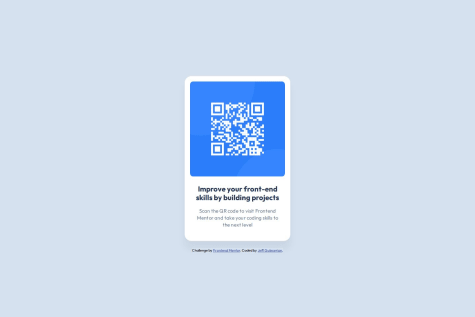
    While this is an easy challenge, I wanted to take the opportunity to pass through each of the Frontend Mentor learning paths. This was the first project required, so I decided to challenge myself to see how quickly I could create the component. I was very happy with my time. Then, I decided to add a couple of extras: turn the QR code into a live link (for those who would view it on a computer screen, but didn't want to go to the site on their cell phone) and add a drop-shadow hover effect.

    What challenges did you encounter, and how did you overcome them?

    No challenges in this project since I have done it before.

    What specific areas of your project would you like help with?

    What I would like help with is understanding GitHub more and becoming more proficient in utilizing what it has to offer. I find that I struggle with having a design work fine in my browser, but when it is published from GidHub Pages, the effects don't work or the image does not show up. I have reduced my frustration by avoiding the leading "/" in references to images or stylesheets but it still does not seem to work in every circumstance. If anyone has some better insight on this, I would really appreciate your help. In fact, if you have any suggestion at all, I would love to hear it.

    Happy coding!

    Jeff

    @nandha126

    Posted

    Your solution is a solid start with clear structure and styling.

    0