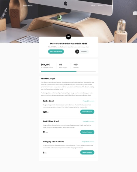
This is my attempt at the crowdfund project. I feel my code is not very DRY, and any suggestions on areas where I could improve my brevity would be appreciated. Thank you!
Amritha Imandi
@mrskodiAll comments
- @KevinSalinaSubmitted over 3 years ago@mrskodiPosted over 3 years ago
Hi @KevinSalina,
Thanks for sharing your solution and the finished design. I do not have the experience to truly comment on the DRY aspect of your code - it will take me a while to write code for that challenge. There are several things in your CSS that I do not understand - eg: filter, webkit etc just to name a few due to my lack of experience. I am sure I will learn them eventually. However, I did notice that you use px for border-radius. You might consider using responsive units (this is something that I have read is a good practice). Hope this is helpful. Thanks, Amritha
0 - @Coryse2Submitted over 3 years ago
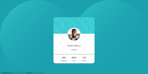
Hi, It's my first challenge. I am looking forward to any comments that will help me to progress. I had difficulties with the background, can anyone give me a lead? thank you!
@mrskodiPosted over 3 years ago@Coryse2, Thanks for sharing your solution. It was a good idea to do media queries. I hadn't implemented it on mine. I also had a hard time with the background images and took me a while to figure it out. Looking at this solution: https://www.frontendmentor.io/solutions/my-profile-card-challenge-solution-using-just-html-and-css-0B55Wretk, the background looked so simple. Sharing here for your reference. Hope this is helpful.
0

