Not Found
Not Found
Not Found
Not Found
Not Found
Not Found
Not Found
Not Found
Not Found
Not Found
Not Found
Not Found
Not Found
Not Found
Not Found
Not Found
Not Found
Not Found
Not Found
Not Found

All comments

  • @Bahbah89

    Submitted

    A fun little project on which I tested my basic HTML and CSS skills. Started this project 1 year ago, feeling frustrated, and unfortunately gave up on it. Now I have a better understanding of how to go step by step to create something like this. The key element I've learned during this project is to keep a cool head when things aren't going your way and look things up if you don't know for certain.

    What did I find Difficult?

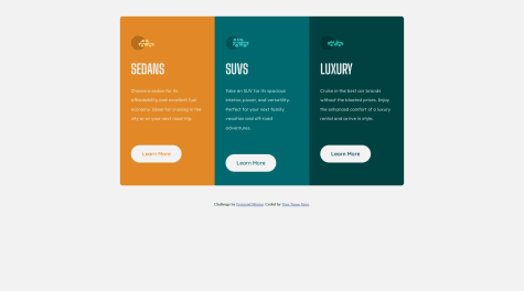
    • Display the card formation properly at screen size from 1110px to 740px.

    Which Area of your code are you unsure of? -I used in the div 'container' 3 extra divs that represent columns in which the cards are displayed.

    I'm open to feedback :)

    @melquawest

    Posted

    Well done Jesse! However, I suggest you write a media query so the design looks great on all devices. Using only 'flex-wrap: wrap' on the '.container' won't solve it. I hope this helps!! Thanks!

    Marked as helpful

    0
  • @wdelanoy

    Submitted

    • Used custom properties to define the colors. This will allow me to change all the colors just by making changes in the custom property itself, and that will flow down to all my CSS declarations

    • Went with a mobile first approach. This allows the simpler layout (mobile) to be the main layout, and then less declarations need to be made in the media query

    • In the hover effect, the background color needs to match the background color of the corresponding card. I used the 'inherit' function on the background color so that it will take on whatever background color assigned to its respective ancestor

    @melquawest

    Posted

    Great job, Will!

    0
  • @melquawest

    Posted

    You've done a great job, Jimoh. However, you can use media query to improve the mobile view.

    1
  • @melquawest

    Posted

    Hello Jeng! That's some nice design. However, you've got one thing to fix. The "mobile view". There must be some space between the container(card) and the sides of the view port. Fix your media query to solve this problem.

    0
  • @melquawest

    Posted

    You write clean codes. I like that!

    1