
@RohloffmeisterSubmitted 10 days ago

P
AnDev
@marynaKolikovaAll comments
- @marynaKolikovaPosted 6 days ago
Hi! Cool implementation. For some reason, the copy password button does not work. Maybe because the method is not implemented.
0 - @RohloffmeisterSubmitted 16 days ago
- @RohloffmeisterSubmitted 16 days ago@marynaKolikovaPosted 15 days ago
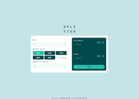
Hello! Very cool implementation of grid and flex, but I like the functionality better as in my implementation https://marynakolikova.github.io/TipCalculatorApp/
Marked as helpful1 - @jolman009Submitted 3 months ago
- @nekeferSubmitted 3 months ago@marynaKolikovaPosted 3 months ago
Hi! Very nice implementation. It would be nice if you added at the end of the notification is the e-mail entered by the user It's in that success message.
0 - @Mohamed806HSubmitted almost 2 years ago@marynaKolikovaPosted 3 months ago
Hi! Use max-width instead of width, this will make your code flexible.
Marked as helpful0 - @DaggahhSubmitted 3 months ago@marynaKolikovaPosted 3 months ago<div class="preparation"> <h2>Preparation time</h2> <ul> <li> <span>Total: </span>Approximately 10 minutes </li> <li> <span>Preparation: </span>5 minutes </li> <li> <span>Cooking: </span>5 minutes </li> </ul> </div> - it is my section
.preparation { padding: 24px; max-width: 656px; - it is make this block flexible ! background: #FFF7FB; border-radius: 12px; margin-bottom: 32px; }
0 - @DaggahhSubmitted 3 months ago@marynaKolikovaPosted 3 months ago
Hi! Use max-width. It do your site flexible. Try it and you see when all change
1 - @tunaertenSubmitted 3 months agoWhat are you most proud of, and what would you do differently next time?
It wasn't a very challenging project, but it was quite fun. I started with the mobile design first. I think next time, even if I begin with the mobile design, I'll organize the components with the desktop design in mind. I'll design each section (mobile, tablet, desktop) not separately but as a whole.
What challenges did you encounter, and how did you overcome them?I had quite a hard time adjusting images for different screen sizes. I had to do a lot of research, especially between the hero image on large screens and tablets. When I first wrote the code, I didn't use the picture tag, but I later changed the hero section. Next time, I’ll plan the images for different screen sizes better from the start.
What specific areas of your project would you like help with?The last change I made before publishing the page was adjusting the heading font size according to the page size. I used clamp for this. I'm not sure if it's the ideal ap proach. I achieved the result I wanted, but I'm open to your advice on this.
@marynaKolikovaPosted 3 months agoHi! Very cool! Unfortunately, I have nothing to add.
Marked as helpful0 - @marynaKolikovaSubmitted 3 months ago
- @verakissyou17Submitted 3 months ago@marynaKolikovaPosted 3 months ago
Hello, very interesting implementation, but I would limit the width on large screens max-width: 1110px;.
Marked as helpful0 - @marynaKolikovaSubmitted 4 months ago