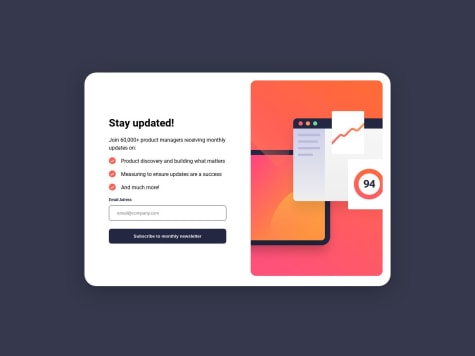
I do not know why my background image is not showing on live web. It is actually showing on the local server (live server). Any help on how to correct this will be highly welcome. Thanks.
Luis De Freites
@luismadfAll comments
- @OlawalefarukSubmitted 11 months ago@luismadfPosted 11 months ago
Hello Faruk,
Congratulations on finishing this challenge! 🎉
The image isn't showing because a path problem, for some operating systems a path like this "/images/image.svg" it's ok, but for other isn't (for example the ones that we use to upload our websites).
To fix this, it's as simple as adding a dot (.) at the beginning of your image path. This indicates that the path should be relative to the current directory, making it more universally compatible across different operating systems.
/* Layouts styles */

.background {
  background-image: url('./images/background-pattern-mobile.svg');
Marked as helpful0 - @Moulaye-dagnonSubmitted 11 months ago
First of all I had been struggle about how display the page thanks after submitting of form and secondly how to change the image src betwen the mobile screen and the desktop .
I am not sure of the App.jsx because I think there are others , much simpler paths. I'd like the community to give me feedback on my code because that's the only place I can get it@luismadfPosted 11 months agoHi,
I recently completed this challenge too :)
I can help with some of the stuff you are asking about, but keep in mind there are many ways of doing things with code.
1. How to display the "Thanks" page:
Here the first thing I can recommend, is a little detail but it could be useful for people that are reading your code is to use a descriptive variable name instead of showPage, it could be something like isEmailConfirmed.
Besides this there are many ways of doing this, in my case I used React Router because in my mind I made sense to have different pages for this with differents URL's, but your case may be different. So I don't think you did a bad approach.
2. How to change the image src:
In my case I was using tailwind CSS which includes some utilities classes that make this really easy, using CSS media-queries instead of JS code will help your app performance, save you some lines of codes and complexity in your app.
This can be different depending on your CSS skills and the way you and your team are structuring the code of the app .I saw your code and you are using media-queries around your app already so I think it makes sense to use it for this case too.
Maybe you can try using two images tags instead of one?
This is the link to my code if you want to take a look.
3. The App.jsx file:
First, I'll recommend to use a code formatter tool such as Prettier so it will make your code more readable.
Second, It seems that you are creating the screen for the first page but then using a component for the "Thanks" page, my recommendation is to avoid "creating screens" in the App.js unless is a really small app, a common practice in the development community is to create a 'page' folder and place your pages there.
I hope this feedback can be helpful for you.
Greetings!
Marked as helpful0 - @MattJones0813Submitted about 3 years ago
The challenge is not fully complete as of yet.
I changed the height of the header to 100vh which is why the image isn't the same as I thought it gave the user more of an inclination to scroll down to see the rest of the content.
I still have some fixes to implement that I am aware of: JS to make the mobile navigation work. JS to make the header sticky. (Desktop/ Tablet) and an issue where the grid is responsive but one of the divs is a different size @ 50em/ 36em.
I would really appreciate feedback on these issues and potentially how to fix/ implement them!
@luismadfPosted about 3 years agoHi Matt,
I'm currently working on this challenge right now. I want to help you with the following questions:
"JS to make the header sticky" This can be easy solve with a "position: sticky" and it will consume way less resources.
"and an issue where the grid is responsive but one of the divs is a different size @ 50em/ 36em": I personally love to use css grid so I just gave them a grid-template-row: 3fr (for the text div) and 2fr (for the picture one).
I hope it helps and great job! Greetings!
Marked as helpful0


