Kevin Ebenhezer
@kevinebenhezerAll comments
- @Jayashree-26Submitted 8 months ago
- @cristianccggSubmitted 8 months agoWhat challenges did you encounter, and how did you overcome them?
This one has been the hardest so far, but I consider the final result to be very decent.
What specific areas of your project would you like help with?The only thing I couldn't do was to make the radio button transparent with a border. I managed to make it transparent but it was impossible to place a border. If somebody knows how to do it please let me know.
@kevinebenhezerPosted 8 months agoHi @cristianccgg Your solution looks amazing!
I could give you some advice regarding your concern about making the radio button background color transparent, if you don't mind.
1. Replace
<p>tag with<label>and put it below the<input type='radio'>2. Put the value into the label, like :
<label for="30min">30 minute walk</label>3. Style the
<input type='radio'>todisplay = none4. You can use pseudo-element on label like this,
label::before5. Next, style your
label::beforelike:content: ""; position: relative; width: 10px; height: 10px; background-color: transparent; border: 1px solid hsl(289, 100%, 72%);; border-radius: 50%; margin-right: 0.5rem; }6. And then you can style the input type radio and the label::before like this:
input[type="radio"]:checked + label::before {
	background-color: white;
}
Basically, we just create a new custom radio button. But still functioning like the original one. Because, as i know, we can't really style the original radio button. Might as well create a new customize-able one. So we can style it as we want. Because pseudo-element is great use on a case like this.
This method works great on me!
I hope this would help you with your problems. Good luck and happy coding!
Marked as helpful0 - @SarthkKSubmitted 9 months ago
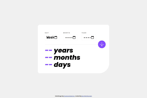
How would you animate the numbers? Also, some input on how to make the responsiveness better would be much appreciated :)
@kevinebenhezerPosted 9 months agoHello @SarthkK
Regarding your question about animate number, i dont really understand what you meant by that, but i think you should make your input type something like:
<label for="day">Day</label><input type="text" name="day" id="day" class="day" minlength="1" maxlength="2" placeholder="DD" autocomplete="off" />and you can put an empty
<div></div>below that to put on some errors message with Javascript if user not filling the field etc.As responsiveness, i'm not really great with it too btw. But, i supposed that you can start with
@media screen and (max-width: 375px) {}I hope this would helps you with your problems. Other than that, your solution looks amazing
Keep up the good work, and good luck!
0 - @azgpapiSubmitted 9 months ago
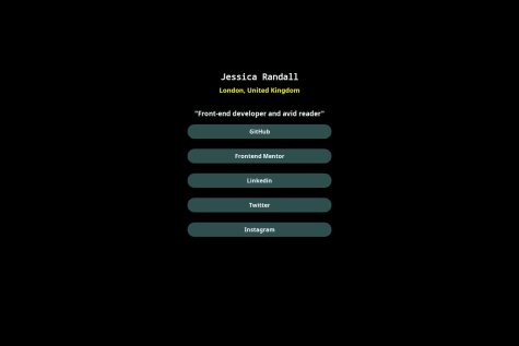
A social-link built with css Flexbox. Come check this out!
@kevinebenhezerPosted 9 months agohello @azgpapi. Regarding your img didnt showed up, i think its probably because your img url look like this : <img src="assets/images/avatar-jessica.jpeg" alt="" />. Try to delete the assets/images/, so the full img url will be like <img src="avatar-jessica.jpeg" alt="" />
0


