juss-10
@juss-10All comments
- @daniel-sebastian-buhaianuSubmitted 10 months ago@juss-10Posted 10 months ago
Hello!
The live version seems to have the same issues at the screenshot. These issues are apparent when the viewport width is
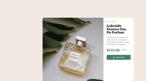
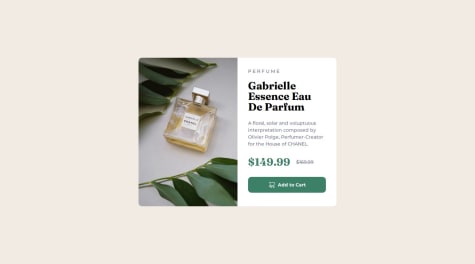
1440pxor wider (from your media query).For me, the product card is not centered and overflowing. This is largely because you used fixed
widthvalues everywhere, but you could also benefit from using better HTML structure. Images as flex children can also be unintuitive.Overflow
- At larger screen sizes, you can see that the product card is overflowing if you temporarily set
overflow: autoon<main>. Then remove that.
HTML structure
- I would not use
<main>as the container for the product card. You might use<article>,<section>, or<div>, but first read through the rest of the issues.
Fixed dimensions
-
Avoid using fixed dimensions with
widthandheight, especially if the element contains text. Instead, usemax-widthormax-height. -
Remove both
width: 343px;andwidth: 600px;(from the media query) from<main>. Instead, set amax-widththat the product component should be. -
Remove
width: 236px;frommain > div(the content side). -
Remove
width: 295pxfrom the button. Usewidth: 100%;or use flexbox to make the button stretch horizontally withalign-items.
Image is flex parent
display: inherit;is inheritingdisplay: flex;. The image should bedisplay: block;
Box sizing
- Add
* { box-sizing: border-box; }. This uses the universal selector to target all elements to use theborder-boxsizing model, which is more intuitive than the default. This is related to the box model, and you should be familiar with both. Go read what the difference is if you are not already familiar with it because normally you would always add this.
Images as flex children
- The behavior with images as direct flex children is not intuitive, so I would recommend to not use them as flex children and instead use a wrapping element as the flex child, like a
<div>or<picture>. Place the image inside those. You can useobject-fitto make adjustments if needed.
Use
<picture>- Don't use two different image elements and hide one of them at different media queries. Instead, use the
<picture>,<source>, and<img>elements together. The<source>element accepts amediaattribute to tell when the image should be displayed, e.g.<source media="(min-width: 75rem)" srcset="your-image.png">.
Links to learn more:
Marked as helpful0 - At larger screen sizes, you can see that the product card is overflowing if you temporarily set
- @NantueSubmitted 10 months ago@juss-10Posted 10 months ago
Hello!
Congrats on finishing the challenge! Visually the component looks very close to the design, but there are a number of issues in the code.
Here are some problems I noticed:
Height and Grid
Using
100%inbody { grid-template-rows: 100% 1fr }occupies 100% of the height set bybody { height: 100vh }for the first grid row, which does not leave any additional space for1frin the second grid row. This is causing the text in<div class="attribution">to overlap with the product card.-
You can change
body { height: 100vh }tobody { min-height: 100vh} as well as changebody { grid-template-rows: 100% 1fr }tobody { grid-template-rows: 100% auto }orbody { grid-template-rows: 1fr auto }. -
Setting
body { min-height: 100vh }can have some issues on mobile, but there are other ways of approaching setting a height forbody. I recommend you look more into this.
Use <picture>
- I would not recommend using two separate
imgelements and hiding one or the other when needed. Instead, you can use the<picture>and<source>elements along with theimgelement and an inline media query with themediaHTML attribute on the<source>elements to specify which image to use when the width of the viewport is at that size:
<picture>
	<source media="(min-width: 60rem)" srcset="images/large-image.png">
	<source media="(min-width: 40rem)" srcset="images/medium-image.png">
	<img src="images/small-image" alt="Description">
</picture>
Capitalize text in CSS
Instead of capitalizing text in the HTML, use CSS to do this.
selector {
	text-transform: uppercase;
}
Price elements
The price does not need to be a heading and the structure can be simplified a bit. There are few other adjustments here that you can make. - The
visually-hiddenclass will visually hideOld price:for sighted users and allow users with screen readers to hear this text. You can find out more about using avisually-hiddenclass online.<p class="price"> <span>$149.99</span> <s><span class="visually-hidden">Old price: </span>$169.99</s> </p>Buttons
I'm not sure why you used a
divelement for the button, but that's not recommended. That is not a button. Use a<button>element for "actions" and use<a>for links. You sometimes may have links (<a>) that look like buttons, but still only use<button>for actions and<a>for links.Decorative images and icons
The shopping cart icon in the button is decorative, so it doesn't need to include a value for
alttext.Product Card Container
Personally, I would not have used
<main>as the container for the product card. I would use its own container. This might be<article>, possibly<section>, or just<div>.I hope this helps!
0 -

