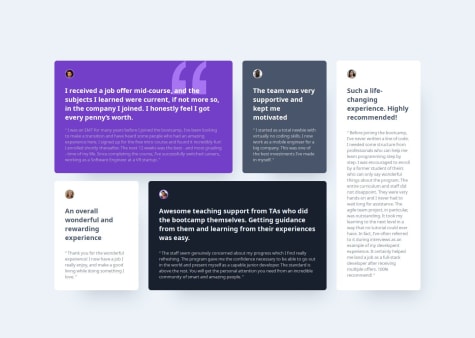
Mainly working with images in CSS [Grid and Flexbox] and any general feedback on writing more concise JS
jaiden-lee
@jaiden-leeAll comments
- @uhmeerSubmitted 6 months agoWhat specific areas of your project would you like help with?@jaiden-leePosted 6 months ago
I really like the animations you did. In my solution, I tried to make the size go from 0 to content-size, but yours fades in. I think that's really smart.
1 - @gia-grigalashviliSubmitted 7 months ago@jaiden-leePosted 6 months ago
This solution isn't responsive. It looks very nice, but it doesn't scale with screen size. The main issue is that the width of the grid layout doesn't ever change. Instead of setting a fixed width, you can set a max-width. This would allow the width of the grid container to shrink with the screen size.
0 - @MattJM1007Submitted 6 months agoWhat are you most proud of, and what would you do differently next time?
I was able to use grid to get it to be responsive as well as set card sizes without setting fixed widths and heights. Also used rem for everything instead of px.
What challenges did you encounter, and how did you overcome them?I didn't find anything particularly challenging. I felt that I improved on setting the card sizes without using fixed sizes.
What specific areas of your project would you like help with?The one thing I found difficult was setting the responsiveness for mobile. I had to set a fixed width to get the cards to be the same width when stacked on top of each other with flexbox. Is there a better way I could have done this without setting the fixed width?
@jaiden-leePosted 6 months agoThe site is very good and very clean. It is also responsive for the most part. One suggestion I have is for the mobile layout, the sizes of the cards don't shrink when the width gets too small. To do this, I would set a max-width property, rather than a specified width. This would allow for the mobile layout to have a max-size (so it doesn't keep growing), but would also be able to shrink for smaller widths. I would also use box-sizing: border-box with the top colored borders on the cards.
1 - @Anuar06Submitted 6 months agoWhat are you most proud of, and what would you do differently next time?
Nothing
What challenges did you encounter, and how did you overcome them?not much challenges.
What specific areas of your project would you like help with?nothing
@jaiden-leePosted 6 months agoThe responsive functionality could use a little more finetuning, possibly by using properties such as flex-shrink. Also, the image loses its aspect ratio when I shrink it.
1


