@kadiryildiriSubmitted 3 months ago
What are you most proud of, and what would you do differently next time?
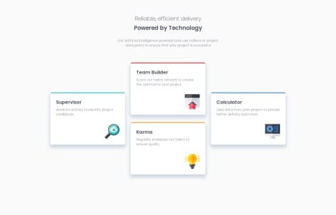
I was proud to see that I was doing better at Tailwind.

I was proud to see that I was doing better at Tailwind.
Great job its almost similar to the original ,you can give top margin of 150 or 200 px to match it even more
This is the code that I am most proud of yet. The main thing I want to do different is work on my formatting. I feel I still have room for improvement in that area. Less divs as well.
What challenges did you encounter, and how did you overcome them?This was probably the easiest design I've done so far. Formatting was my biggest challenge and patience helped me overcome that.
What specific areas of your project would you like help with?Any tips or constructive criticism welcome.
Great job at replicating it as it is.......... its impressive
Setting the main as a card later on in the desktop view from the full display in the mobile view was difficult. But I tried to give it a max-width in the media query and also gave the main parent a margin of 5% for both top and bottom while setting the horizontal margin to auto.
What specific areas of your project would you like help with?I would really like to hear better ways to do what I mentioned above. Because I know the method I used is only an improvised one. Looking forward to your feedback!
It is really great ,but try putting table border as collapse i.e.:- border-collapse : collapse , and than put:- table tr{ border-bottom: 4px solid black}.
I used CSS variables to make my work more clean, readable, and reusable.
The solution looks great and it matches the layout pretty good. As my solution is also smaller in size only thing to do is increase the height of it and more small changes .
Yes the solution include sematic HTML. Improvements can be made as to its images and alignments and many i think. I think the layout is acceptable . yes the code is structured good and is indeed reusable. I think there is the difference in size ,any advice as to how to improve it will be very helpful.
Yes, the solution include sematic html. yes the solution is accessible, and improvement can be made in the height and the width of qr-card . yes i believe the layout is good int different range of sizes. I can take help with structuring the code properly. The difference between solution and the design id the size of the qr-card , I believe.