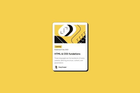
@agusmcuelloSubmitted about 2 months ago
Elizabeth Agunroye
@funmeelayoAll comments
- @funmeelayoPosted about 2 months ago
This is really nice. Very close to the design
Marked as helpful0 - @matheusss14Submitted 6 months agoWhat are you most proud of, and what would you do differently next time?
It did end up looking similar enough, although I feel like it couldve been done quicker
What challenges did you encounter, and how did you overcome them?Took me a while to start remembering how to do stuff, once I got back on track it was alright
What specific areas of your project would you like help with?responsiveness
@funmeelayoPosted 6 months agoThe layout looks good and is similar in structure to the design. The colors are a little different(Especially the background color), the use of the style guide provided will have helped solve this issue. The spacing does not also look pixel-perfect. Overall the design and the solution look similar to each other. I couldn't preview the code and the site(Error 404) Great Job.
0

