Mastering Tailwind through Frontend Mentor Challenges
David Tejada
@david-tejadaAll comments
- @jmmaglonzoSubmitted about 1 year ago@david-tejadaPosted about 1 year ago
Here are some observations:
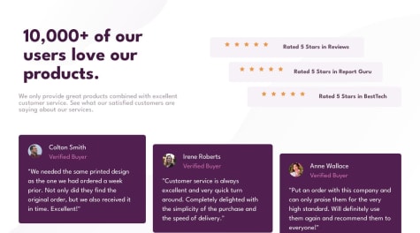
- The stars look distorted because the flex parent has the default
align-items: stretch, change it tocenter. - You have an empty section element at the bottom of your html.
- The use of
@applyis discouraged for most cases by the author of tailwind himself: Reusing Styles - Tailwind CSS - Add
node_modulesto your.gitignore. - You also shouldn't commit build assets to source control. Find a way to provide the build command to the hosting provider. I'm not sure how to do it with GitHub Pages but there has to be a way.
1 - The stars look distorted because the flex parent has the default
- @pmzproSubmitted about 1 year ago
Hello Everyone!! =)
This is my second challenge. Initially, I had some difficulties with the flex and grid positions, but I figured out that my HTML semantics were not correct
What I Learned in this challenge
- Learned how to make the layout responsive for the user experience depending on their device's screen size.
- Learned how to add a small logo inside a button.
- Learned the importance of CSS reset.
- Learned how to make focus state for interactive elements.
Built with
- Semantic HTML5 markup
- CSS custom properties
- Flexbox
- CSS Grid
Feel free to say what I could've done better
this code got inspired in Kevin Powell video
@david-tejadaPosted about 1 year agoThis looks very nice. One small issue is that at a viewport width of between 600px and 622px the image doesn't completely cover the left site of the card, which doesn't look good. You can use
height: 100%andobject-fit: coverto fix this. This will ensure that the image will cover the whole left side and that it won't be distorted0 - @ccccchrizSubmitted about 1 year ago@david-tejadaPosted about 1 year ago
Here are some observations:
- The padding in your card is smaller than in the design.
- You need to increase the line height of the paragraph.
- The rating buttons aren't flush with the card as in the design. You could use
justify-content: space-betweenfor that. You need to change some stuff before for that to work, though, because.scoresis a flex child withalign-items: centerin the parent. - The component is not very accessible. For example, there is no way to access the ratings buttons with the keyboard. They also provide no context for screen readers. The main issue is that you're using divs to create the ratings buttons. You should use inputs of type radio. This is more complex than what you did because you need to visually hide the radio controls but keep them visible for screen readers. You can take a look at my solution for inspiration.
- The radio group and the submit button should be enclosed within a form.
- You should make sure that images that are purely decorative are ignored by screen readers. You can use an empty
alt=""for that. - I'm not sure why you made the star a button. I think that's just supposed to be decorative.
- The active states of the ratings buttons are supposed to be the other way around. Orange for hovering and gray for checked.
- The cursor for the buttons and ratings should be a pointer.
Marked as helpful1 - @Wael-OrrabySubmitted about 1 year ago
If there are any ways you think the code could be better, I'm all ears! Your feedback means a lot to me.
Thanks a bunch! 😊
@david-tejadaPosted about 1 year agoHere are some observations:
- You switch to desktop layout way too late. You seem to have taken the value of 1440px from the style guide. That's only the value the designer used to create the design. You need to use your judgment to estimate what the right breakpoint needs to be.
- The page looks bad at large screen sizes. Try to set a max-width.
- The top heading and paragraph are not centered in mobile layout. Using left and right margin of auto could be useful here.
- The stars aren't aligned with the text in the desktop layout. In order to do this you can remove the bottom margin of the individual images and use the flexbox property
align-items: center.
Marked as helpful0


