Hi Kate, Good job on completing this challenge!! 👏
On your question, I think the problem is because you put style opacity on both transparent class and span element. In CSS this can be a conflict, especially when the class transparent is in the parent element of the span which is the p tag. In this case.. instead of using a style opacity on the transparent class.. you could just write this..
.transparent {
color: hsla(0, 0%, 100%, 1, .7);
}
this is an hsla color element with an opacity of .7.. this way. it will not have any conflict on any of its child element. Hope this can help you. Happy coding!! 😁
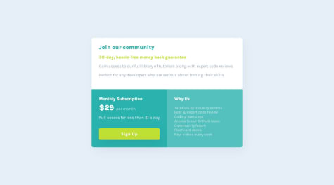
In the mobile version, both the div-img-container and the div-filter become larger than the img and this makes the filter appear overflowing, I tried giving height: 100%; but the img doesn't fit the size either. Why is this happening? How can I solve that?
Hi, Great work in finishing this challenge!! To your question, I think the problem lies with your main tag.. you set your main tag's width to a percentage. using a percentage in width will stretch your container as the screen gets bigger.. so if you want it to be at fixed size. you should consider using a fixed size also.. I would suggest using the 375px for the max-width for mobile.. then for wider screens you can use 567px or 768px so it would not stretch so much. Hope this will help fixing your problem. Happy Coding!!
what i would do here is create a media query for mobile screen and with your .card-box you can flex-direction: column.. it should position your boxes in column. just adjust the gaps on it and its good. hope this helps :)
I need some help. For some reason, for my .for-padding, I could not use justify-content or align-content. I had to use gap to separate them. I am not sure why. Maybe you can help me figure it out.
uhm i think the problem in your .for-padding was the height wasn't enough for it to do a justify-content. you can declare the height to 100% first then your justify content will work. hope this can help.

