

@alkersanSubmitted 8 months ago
What challenges did you encounter, and how did you overcome them?
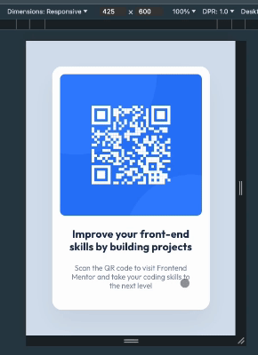
It was tricky to figure out how to prevent vertical and horizontal content loss on smaller viewports, e.g. less than 320px (see the screen recording). Here's the snippet that worked for me (and resulting recording):
const Main = styled.main`
    ...
    min-width: fit-content;
    min-height: 100%;

    display: flex;
    justify-content: center;
    align-items: center;
`;

const CardWrapper = styled.div`
    // Don't grow horizontally more than minimally possible to contain the card
    // I guess it works because nested image has fixed dimensions
    max-width: min-content;
    ...
    img {
        display: block;
        width: 288px;
        height: 288px;
    }
`;
