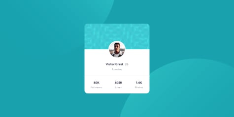
Any suggestions on how to improve my code is welcome. Thanks!
cheg
@chegxAll comments
- @peterbujakySubmitted almost 2 years ago@chegxPosted almost 2 years ago
Hi @peterbujaky! In Firefox browser the button doesn't work. You can add an option
{cache: "no-cache"}to make it return a new piece of advice.fetch("https://api.adviceslip.com/advice", {cache: "no-cache"}) .then(res => res.json()) .then (data => { const advice = data.slip.advice; const id = data.slip.id; document.getElementById("adviceText").innerHTML = `"${advice}"`; document.getElementById("adviceID").innerHTML = `ADVICE #${id}`; }) document.getElementById("button").addEventListener("click", () => { fetch("https://api.adviceslip.com/advice", {cache: "no-cache"}) .then(res => res.json()) .then(data => { const advice = data.slip.advice; const id = data.slip.id; document.getElementById("adviceText").innerHTML = `"${advice}"`; document.getElementById("adviceID").innerHTML = `ADVICE #${id}`; }) })Marked as helpful1 - @VictorResinesSubmitted almost 2 years ago
What did you find difficult while building the project?
Part of the layout with CSS grid properties
Which areas of your code are you unsure of? I couldn't get the mobile navigation links to be closer to the left edge of the background
Any feedback is appreciated 😉
@chegxPosted almost 2 years agoHi Victor! You could get the navigation links closer to the left if you remove justify-content: center; and add margin-left to navigation links. Also you can get the same shadow-effect if you add box-shadow instead using backdrop-filter.
  .main-nav {
      background-color: rgb(253, 242, 233); /*remove opacity*/
      box-shadow: -10rem 0 rgb(0, 0, 0, 0.5);
      position: absolute;
      top: 0;
      left: 0;
      height: 100%;
      width: 100%;
      transform: translateX(100%);
      display: flex;
      align-items: center;
      transition: all 0.5s ease-in;
      /* 1) Hide it visually */
      opacity: 0;
      /* 2) Make it unaccesible to mouse and keyboard */
      pointer-events: none;
      /* 3) Hide it from screen readers */
      visibility: hidden;
    }

   .main-nav-link:link,
   .main-nav-link:visited {
      font-size: 1.1rem; */smaller size*/
      margin-left: 2rem;
    }
Marked as helpful0 - @jvmdoSubmitted about 2 years ago
I've applied
max-height: 0andvisibility: hiddenthenmax-height: 10remandvisibility: visible. This way the box is displayed from top to bottom on transition.How could I make it to display it from bottom to top using this same hidden/visible technique?
@chegxPosted almost 2 years agoHi JOÃO. You can change the
topproperty tobottom:.card-share { align-items: center; background-color: hsl(217, 19%, 35%); border-bottom-left-radius: 0.75rem; border-bottom-right-radius: 0.75rem; display: flex; gap: clamp(1rem, -1.737rem + 11.68vw, 2rem); height: 4rem; max-height: 0; /* overflow: hidden; */ visibility: hidden; padding-inline: 2rem; position: absolute; bottom: 0; transition: all 0.4s cubic-bezier(0.25, 0.46, 0.45, 0.94); width: 100%; }The same for Desktop Layout. Remove
topproperty and calculate position from thebottom.Marked as helpful0 - @R-CODE01Submitted about 2 years ago@chegxPosted about 2 years ago
You can center img without positioning. Put the background image into main so it will act like background and won't interact with img. I commented your old code that you should remove.
main {
    background-image: url(images/bg-pattern-card.svg);
    background-repeat: repeat-x;

}

/* main .header {
    background-image: url(images/bg-pattern-card.svg);
    width: 100%;
    height: 157px;  */


main .body {
    text-align: center;

    /* position: relative; */
}

main .body img {
    /* position: absolute; */

    border-radius: 50%;
    border: 5px solid white;

    /* left: 50%;
    top: -51px;
    transform: translate(-50%); */

    margin-top: 90px;
}
0


