Not Found
Not Found
Not Found
Not Found
Not Found
Not Found
Not Found
Not Found
Not Found
Not Found
Not Found
Not Found
Not Found
Not Found
Not Found
Not Found
Not Found
Not Found
Not Found
Not Found

All comments

  • Varsha 10

    @VarshaRajS

    Submitted

    The questions I would like to ask the community are as follows:

    What are the best practices while writing code? How to write structured code and does it have an effect on how the website works?

    The problem I usually encounter is that I keep forgetting some of the concepts. How to become strong in my CSS fundamentals such as grid and flexbox?

    @bally4h

    Posted

    Good questions.

    But I think you are at the right place, the frontend mentor.

    I do the following: I try to finish the challanges only me, with out any help. Only if I face something really new (position: absolute in my last challange) I google it and try to memorize.

    After I finish my project, I start to analize the codes of the others and take some question to myself. Which code is better? My solution with the margin-bottom, or the other with the grid-row-gap? Which looks better? Which is faster? Where I need to type/read more? Which code is more simplier, better to understand? And I google it and read the best cases for the situations.

    After these I start to change my old code to have a better solution. This step is needed to have experience. And after I start my next challange and try to use the new knowledge and try to write better code.

    I hope this helps you be better.

    Marked as helpful

    1
  • @ThereIsJustNothing

    Submitted

    Idk guys, iam just starting. If there is something wrong, or something to improve (sure there is...) feel free to let me know! :)

    @bally4h

    Posted

    Hi!

    You started very well and good to know you are here to know, in what you can develop. I started only a few mont ago, so I'm not an expert, but I have some suggestion to you.

    You sould have a HTML <main> element, which represents the main content of the of a document or application.

    The design. I do this: when I think I finished a project, I step back from the monitor and try to watch the homepage with the questions as outsider: Is it nice? Is it well organized? Font sizes, paddings, margins how could be better?

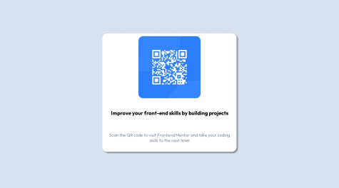
    Mobile view is fine! But when you take this questions in your desktop view, you will see, under your <h1> there is a too big area, and under the <p> there is nothing (no margin, no paddig). Defenetly there is padding and margin but you cannot see it, because the <p> content overflows down from the .window

    This is because you use fix sizes: (px) an some vh everywhere. I suggest to you, you can use the fix sizes in <h1> and <p> but use for the .window class for example: height: auto. In this case your .widow will be big enough to hold the contents inside it.

    Keep going, it will be better and better after every project. As I said, I started some month ago, and I am better and better after every challenge.

    Best regards!

    0
  • @bally4h

    Posted

    Hi!

    I think you are on the good way! I want to suggest only a few thing at this stage.

    To have a responsive page, instead of using absolute units, pixels etc.., it is more advanced to use relative units (rem, em, %, ...)

    You tried to push down your container from the top, like this:

       .conteiner{
            margin-top: 120px;
           
       }
    

    Yous should try flexbox or grid to reach ypur goals easily.

    I think 2 rows with grid will do the job for you. With this code you make the body a grid container and your "conteiner" will be absolutly centered, and no need to use margin-top and pixels..

    The code is:

    body {
      display: grid;
      place-items: center;
    
    }
    

    An other suggestion, it is always good to familiarize yourself with the separeted style.css file. If your html code stretch longer and longer, it will be easier to read and manage the separated file and add some comments.

    I wish you the best!

    0
  • @bally4h

    Posted

    Hi!

    I think your solution is very good. I want only suggest two things:

    Your question was how to adjust the images. I think there are a lot of possible solution, flex box, grid or many others. For me the ::before pseudo was the simpliest solution: I made the paragraph and then in css:

    .blue::before { content: url("./assets/images/icon-visual.svg"); position: relative; top: 4px; right: 5px; }

    You can try playing with the top and right pixels to get the best result.

    The others suggestion, take your time to observe the challenge. There are more complicated colors, whiches you didn't used: the backgroud and the circle has two colors and some gradient beetween them:

    background: linear-gradient(hsl(252, 100%, 67%), hsl(241, 81%, 54%));

    I hope this helps you, I wish you the best!

    Marked as helpful

    0
  • @bally4h

    Posted

    Hi!

    Very nice solution. I want to suggest you some short advice.

    I think you could use the given svg mobile and in media query section the desktop file as backround-image,. The background-repeat property could be no-repeat and a background-size: contain. In this case the svg background pic will only one time on the screen.

    Maybe you could use in the html some classes for the same properities, because too much #id is a bit confusing and hard to read/understand the css file.

    for example these are in ypur code:

    #plan #plan-box {
      ...
    }
    #plan #plan-box #text {
     ...
    }
    #plan #plan-box #text h3 {
      ...
    }
    #plan #plan-box #text p {
    ...
    }
    #plan #plan-box #link {
    ...
    }
    #plan #plan-box #link a {
    ...
    }
    #plan #plan-box #link a:hover {
    ...
    }
    

    Instead of these you can use classes in the html.

    for example in html (<p class="bold">) and in css: .bold: {font-weight: 700;} And give all the <p> the "bold" class which you want to be bold, and so on the other properties..

    Keep going!

    Marked as helpful

    0
  • @bally4h

    Posted

    Hi!

    Nice work, just some opinion.. You should always have a "h1" tag on your page. Images need an "alt" tag if it not loads with the page. alt="some image"

    Good luck!

    Marked as helpful

    1