Skip to content
Learning paths
Challenges
Solutions
Articles
Unlock Pro
Log in with GitHub
Profile
Overview
Solutions
11
Comments
1
Avinash Kumar Yadav
@avinash4364
Follow
All solutions
Submitted over 1 year ago
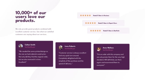
Responsive social proof section using CSS grid and flexbox
HTML
CSS
0
2
0
Submitted over 1 year ago
Responsive huddle landing page using CSS grid and flexbox
HTML
CSS
1
2
0
Submitted over 1 year ago
Responsive price grid component using flexbox and grid
HTML
CSS
0
4
0
Submitted over 1 year ago
Responsive profile card component using flexbox
HTML
CSS
0
2
0
Submitted over 1 year ago
Responsive 3 column preview card component using css grid and flexbox
HTML
CSS
0
2
0
Submitted over 1 year ago
Order summary component using flexbox and grid
HTML
CSS
0
2
0
Submitted over 1 year ago
Responsive NFT preview component using flexbox
HTML
CSS
0
3
0
Submitted over 1 year ago
Responsive preview card component using flexbox and grid
HTML
CSS
1
2
0
Submitted over 1 year ago
Responsive summary component made using flexbox
HTML
CSS
0
1
0
Submitted over 1 year ago
Responsive page using flexbox and grid
HTML
CSS
1
3
0
Submitted over 1 year ago
Responsive QR code scanner
HTML
CSS
1
6
0
