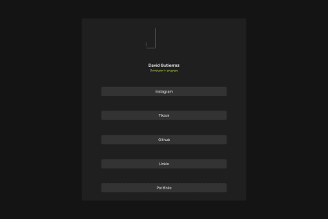
@David2474Submitted 7 months ago
aryakrishnaksh2021
@aryakrishnaksh2021All comments
- @aryakrishnaksh2021Posted 7 months ago
- You must add alt text to the image component
- Add fixed width to the card component instead of ratio width
- Adjust the padding of buttons
0 - @AhmedAwad231Submitted 7 months agoWhat are you most proud of, and what would you do differently next time?
iam proud of i can create a this site like the design
What challenges did you encounter, and how did you overcome them?how to make the text in same place in design
What specific areas of your project would you like help with?s
@aryakrishnaksh2021Posted 7 months ago- You can actually give a transformY animation and shadow animation to the card to achieve a good hover effect
- You can give transition duration and transition-timing-function to achieve a smooth animation
0 - @Dav1dGPSubmitted 7 months agoWhat are you most proud of, and what would you do differently next time?
I would do different next time all the things about size cointainer and image
What challenges did you encounter, and how did you overcome them?Especially the issue of the size of the container with respect to the page and that it was responsive for other devices.
First I used 'width:%' for containers and img but the website was not responsive. Then I tried to use max-width: vh and it improved.
What specific areas of your project would you like help with?About the things I mentioned before
@aryakrishnaksh2021Posted 7 months ago- You have to assign value center to the text-align property in-order to align the heading and paragraph to the center
- You can make use of media query in CSS to make it responsive
Marked as helpful1


