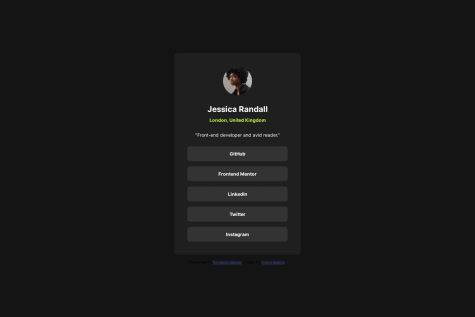
Not Found
Not Found
Not Found
Not Found
Not Found
Not Found
Not Found
Not Found
Not Found
Not Found
Not Found
Not Found
Not Found
Not Found
Not Found
Not Found
Not Found
Not Found
Not Found
Not Found

All comments

  • @armson45

    Posted

    Hey there! I like how you implemented the ::marker. About this project I can say, it's really good the only missing part I can see is padding.

    0
  • P

    @francimelink

    Submitted

    What are you most proud of, and what would you do differently next time?

    Hello, I did this challange again as part of my "learning path".

    What challenges did you encounter, and how did you overcome them?

    I didn't have any particular troubles with this task.

    What specific areas of your project would you like help with?

    I didn't have any particular troubles with this task.

    @armson45

    Posted

    Hello :D, I know you already have experience but your project has appeared in my learning path so I'm just responding to the keypoints.

    -Does the solution include semantic HTML? No, but I like the structure regardless of the semantic. -Is it accessible, and what improvements could be made? I guess you already made it -Does the layout look good on a range of screen sizes? Yes -Is the code well-structured, readable, and reusable? Not reusable I think -Does the solution differ considerably from the design? Nop, I guess some px are missing because of the text under the card but everythinks looks great.

    Marked as helpful

    0
  • Jun41dU 10

    @Jun41dU

    Submitted

    What are you most proud of, and what would you do differently next time?

    I am proud of how I was able to make this project with no help, as well as my attempt at making it responsive using @media. During this first project, I used git for the first time, so I am glad I can now integrate future projects with GitHub and work with other programmers easier.

    Next time I could probably make a better plan out how I would approach the project especially as when it becomes more complex, I could be unsure what to do.

    What challenges did you encounter, and how did you overcome them?

    The challenges I faced was actually deploying the website, as I did not know I had to put the /main.html at the end of the URL for it to display the site, which on reflection was a silly oversight.

    I also had some problems with finding the exact font size I needed as I had to learn how to use googles apis to access the fonts. I feel like the font I have is fairly similar to the design, but it probably could be more accurate. I overcame this mostly through trial and error.

    What specific areas of your project would you like help with?

    When looking at my code, I feel my approach to 'responsiveness' meant that the design isn't perfect, such as the word 'skills' in the main body text not being on the second line like with the example picture. Some pointers also on how to fix this would be great.

    @armson45

    Posted

    Hey there! David here...It looks great but here are some points to dive in.

    -Try to use semantic html5 tags like section, article, headings(h1, h2, h3, etc). -I like the way you name the classes. -I think the problem of the title is because the width of the 'qr_container'. -If you use correctly min-width and max-width you can save some media queries.

    That's all I can say, If you need more help you may want to join to the discord community

    Have a nice day! :D

    0
  • Wasu44 50

    @Wasu44

    Submitted

    What specific areas of your project would you like help with?

    What could I do potentialy do better in my future projects? How to improve my coding to be more professional?

    @armson45

    Posted

    Hello there! I'm a newbie too but let me give you some advice.

    You're html structure is pretty good but try to use the semantic html5 tags instead of divs to improve the accessibility and ceo. Answering to your question: -Use semantic html tags. -Having your styles in the same html file doesn't look good, and also, when it gets larger it will be kinda confusing. -Try to use BEM (Block__Element--Modifier) to name your classes, it's easier when you write your styles because of the naming the hard part is to find a good name :(

    That's all from me. Have a nice code! :D

    Marked as helpful

    0
  • @M-Mikos

    Submitted

    What are you most proud of, and what would you do differently next time?

    I figured out some conflicts between CSS normalizing and CSS reset practises, mostly with resetting margins and paddings.

    @armson45

    Posted

    It actually look real close to the FM design and I also like the way you structure your code.

    1
  • @armson45

    Posted

    Hey there, looks great.

    0