Not Found
Not Found
Not Found
Not Found
Not Found
Not Found
Not Found
Not Found
Not Found
Not Found
Not Found
Not Found
Not Found
Not Found
Not Found
Not Found
Not Found
Not Found
Not Found
Not Found

All solutions

  • Submitted


    Hi everyone,

    This is my Order Summary Component. I don't think that there was something that I find difficult in making the component, but if there's something that you see wrong on how I approach the challenge feel free to comment it out. 😁

  • Submitted


    Hi everyone,

    This is my 
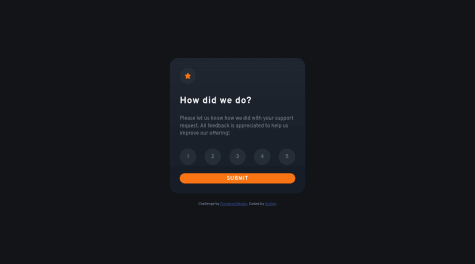
Interactive Rating Component using the Flex Box Layout to center the component.

    I am unsure about the approach in the rating button, I used the "::active" pseudo-element to decrease the code in JavaScript. Is this a good approach in the long run or in the big website's perspective?

    If you think there are some incorrect approach to the challenge, feel free to comment it out.

    Thank you very much! 😁

  • Submitted


    Hello everyone,

    This is my NFT Card Component using the Flex Box Layout to center the card.

    I kinda had a trouble in making the hover for the "eye view", due to having different kinds of approach like "::before" pseudo-element. But I made another "div" element to make it easier, in my case, is this a good approach especially in the long run or to a big website like NFT Website?

    Thank you very much! 😁

  • Submitted


    I used the Flex Grid to center the product card and to make it in a responsive way, while practicing the usability of the code and its cleanliness.

    What are the things that i need to improve here based on what you can see? I asked in a very vague question because I, myself, am still not aware on what to continue to improve and what to stop on doing.

    Thank a lot!!