Amelia Dutta
@amelia2802All comments
- @AhmadMujtaba200210@amelia2802
- Replace
<h5>with<h1>. - Use
<section>instead of div - In the stylesheet set
.qrheight auto and decrease the width. - add media queries for mobile devices (you can set max-width upto 600px) then adjust the style accordingly.
Hope this will help you :)
Happy Coding!🎉
- Replace
- @NicoloSuppa@amelia2802
Hey, Congratulations on completing your first challenge! 🎉
Here are few suggestions to improve your project.
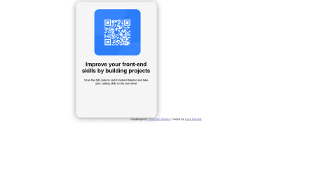
Replace the
<h2>with<h1>and<div>with<section>,<footer>according to your code.Hope you find it helpful!
Happy Coding.😄
- @ZeroScriptz@amelia2802
Hi Zack, Congratulations on completing your first challenge! 🎉
From your code, I can see that
- You've declared the card section
<section class="md">...</section>outside of the<body>...</body>tag. You should declare it inside of the body tag. - Add an
alt=" "attribute to the<img>as it will be helpful for screenreaders. - wrap that
.qrHeadandChallenge by <a href="https://www.frontendmentor.io?ref=challenge" target="_blank">Frontend Mentor</a>with<p>...</p>tags as those aren't headings. - Add display:flex into the
.section{..}.
Hope you find it helpful!
Happy Coding.😄
Marked as helpful - You've declared the card section


