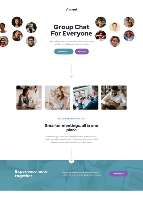
Mais um desafio concluído, dessa vez utilizando React.
Poncho Ramos
@alfonso-ramosAll comments
- @flaviare1sSubmitted about 1 year agoWhat are you most proud of, and what would you do differently next time?
- @Mohamed-ben-AliSubmitted 8 months ago
- @Yashi-Singh-1Submitted 7 months ago@alfonso-ramosPosted 7 months ago
very accurate, only the box shadow that are in another color but you get right with the design
0 - @nilton-manjateSubmitted about 1 year ago
- @mostafajr10psgSubmitted 8 months ago@alfonso-ramosPosted 8 months ago
Good job, I have an observation in your project, when doing it in the mobile view, the component expands so much that it exceeds the limits of the screen, try in your CSS file to give a maximum height to the container, but everything is right with the fonts and colors
0 - @jdcc1024Submitted 8 months agoWhat are you most proud of, and what would you do differently next time?
Started from the astro sample project this time. Beginning to have my own "starting point" for new projects using astro and static pages. Began to experiment with reusable components in astro.
What challenges did you encounter, and how did you overcome them?Ran into a bit of trouble with the best way to componentize the links. Originally used an unordered list, but eventually decided to make a "SocialLink" component, and use the typical array.map to output a bunch of them.
What specific areas of your project would you like help with?Would like to hear some opinions on the way I componentized the social profile. The idea is the data could be managed somewhere and updated without any updates needed for the UI
A slightly modified version of the component from the code:
- @lingowmxSubmitted 10 months agoWhat challenges did you encounter, and how did you overcome them?
My main challenge working with this was installing tailwind and make it work.
- @J-JawadSubmitted 8 months ago@alfonso-ramosPosted 8 months ago
looks awesome, only little details of the colors in the text but, you bite the bullet with this project
0


