Yousef-Abzaby
@Yousef-AbzabyAll comments
- @HanzMalSubmitted 2 months ago@Yousef-AbzabyPosted 2 months ago
-Forgot to remove some of the original code -Wrong back ground color for the div -Your main title is too large -Did not add any top or bottom margins to your main div
0 - @prasadshinde14Submitted 2 months ago@Yousef-AbzabyPosted 2 months ago
Wonderful job creating your solution, I am sure you spent a lot of time and effort into it. Here are my comments: -You made the picture have greater size than the original design -Your buttons are much smaller -The element containing the name of the card is slightly larger than needed These are all my comments and I wish you great luck in up coming projects
Marked as helpful0 - @univxrseSubmitted 2 months agoWhat are you most proud of, and what would you do differently next time?
Creating the hover effects on the card and article image!
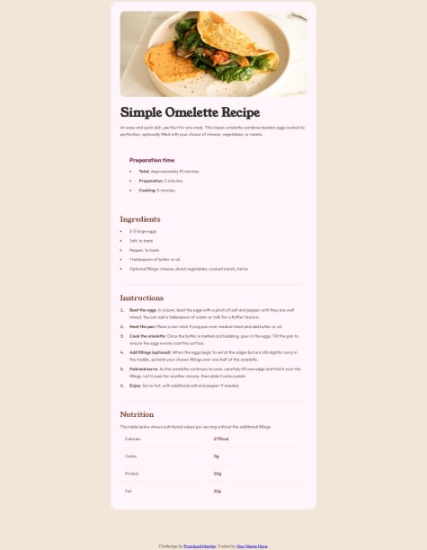
What challenges did you encounter, and how did you overcome them?Getting the summary to fit within the card. Being that p elements are block level items I had a hard time trying to figure out how to style it so it look just like the original.
What specific areas of your project would you like help with?Working with block level elements. Any feedback is appreciated!
@Yousef-AbzabyPosted 2 months agoGreat job creating your solution. Here are my comments:
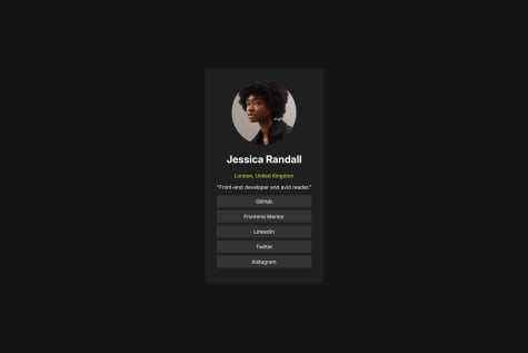
- you forgot to add the color to the p elements -your button does not have the same background as in the design -you forgot to remove some of the default code other than that, nice work
0 - @SaeedAbakahSubmitted 2 months ago@Yousef-AbzabyPosted 2 months ago
Nice work, you have done a wonderful job creating your version of the website. However, there are some comments:
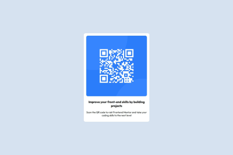
- you forgot to add a box-shadow to your div.
- your div is too wide compared to the original project.
- you needed to increase the border-radius. As good as your project is, I think you made it too complex than wat it needs to be, butt overall great job, and pay more attention to details next time.
0


