@amanda-carpenedoSubmitted 3 months ago
Yassin
@Yassin-1All comments
- @sunidhirautSubmitted 3 months ago@Yassin-1Posted 3 months ago
Nice work @sunidhiraut
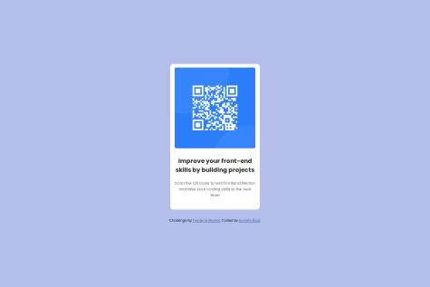
I would just advice to give a bit more radius for the QR code img (I would go 16px for the card and 12px for the img).
Otherwise, I see that the bg color is a darker blue and visually I would prefer the one in the style guide actually :) (Slate 300: hsl(212, 45%, 89%))
Great work !
0

