
Satyaki Pal
@Versatile28All solutions
- Submitted about 1 month ago
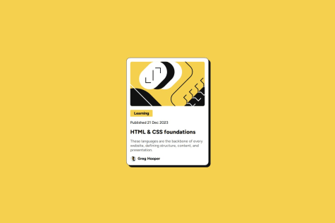
Static webpage using HTML and Basic CSS properties
- HTML
- CSS
While I’m satisfied with the progress on this project, there are a few areas where I could use further guidance:
Cross-browser Compatibility: Ensuring the project looks and functions consistently across all browsers, especially on older versions of Internet Explorer and mobile browsers, remains a challenge. Any tips on handling browser-specific bugs or testing methodologies would be greatly appreciated.
Responsive Design: Although the layout adapts well to most screen sizes, I’d appreciate feedback on how to further refine the responsiveness, especially on very small or very large devices.
Accessibility: I’m striving to make this project more accessible for users with disabilities. Any recommendations for improving accessibility, would be helpful.