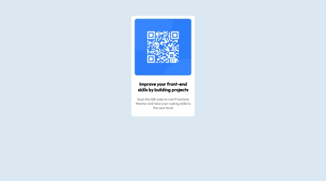
Please, tell me how I can improve!
Tsiangana Zau
@TsianganaAll comments
- @rebecanepomSubmitted about 1 year ago@TsianganaPosted about 1 year ago
Congratulations on your first project, but I can tell you that we can improve it much more in order to gain more experience. When analyzing your code I could see that you used the margin: auto property in the section in order to center it, nice idea to use, but instead of using the margin property you can center it with flex, which is much more advisable to use It is simpler to use in all cases, I will leave an example of how it would be applied in your case, and I will leave the rest to your investigations:
-- body { background-color: hsla(207, 44%, 81%, 0.5); display: flex; align-items: center; juststify-content: center; }
section { background: white; width: 260px; border-radius: 10px; padding: 13px 10px; font-family: var(--font); text-align: center; }
Marked as helpful1 - @nicolas055Submitted about 1 year ago
Hey guys!
This was a great challenge. If you have any feedback, I'd love to hear.
@TsianganaPosted about 1 year agoCongratulations on how far you have come with your project, but I advise you not to publish unfinished projects in order to gain points, as looking at the code of your project you can see that it is unfinished. The real thrill in creating a project is when you finish it and see it working on the internet, this is a marvel for all programmers. If you have doubts or don't know how to finish a project, you can always ask the platform's community on discrd or you can search the platform for solutions from the same project that is having difficulties in order to look at the code and learn how to solve them and create according to the challenge requirements
Marked as helpful1 - @prabha-s4280Submitted about 1 year ago
Provide more info about fonts and colors
@TsianganaPosted about 1 year agoVery good project and very well done, but there are some changes we can make, in order to make it better, yours is very glued to the top, to make it well centered just open your css and put the following property:
body{ display: flex; align-items: center; justify-content: center; }
this way all main elements within your body will be centered, without the need to use the margin property
Marked as helpful0 - @mudasarmajeed5Submitted about 1 year ago
hey as a newbie this is my first front-end project that displays a qr code to the website responsive for all devices.
@TsianganaPosted about 1 year agoCongratulations on your first project, but there are some small changes you can make to improve it, first change the size of the QR code image, it is too big, reduce its size by 20%, second: add the text-align tag :center. this tag that I just told you is used to center texts, to add it you just have to go to your css and your main container which contains all the elements of your work add the property, text-align: center;
Marked as helpful0 - @AlyssaWoodsonSubmitted about 1 year ago
Hi, this is my first project and I would love some feedback! (Especially with my CSS) 😆
@TsianganaPosted about 1 year agoCongratulations on your first project, I hope you continue to strive, I saw your code and you worked very well, you just failed to call the css, you called the css like this '<a href="./index.css">< /a>' that's why he didn't get the css in the call with the 'a' tag. This tag is only used to create links and not to call links. To call a link we use the 'link' tag, that is, to correct the error in your code you just have to delete this '<a href="./index.css"></a>' and put this in its place '<link rel="stylesheet" href="index.css">'
Marked as helpful1 - @ryiianqueirozSubmitted about 1 year ago
I made this landing page responsive for Desktop / Tablet / Mobile
Let me know what you think and upgrade something else
@TsianganaPosted about 1 year agoI really liked the web app, the code is not very clear, I think you could work more on it and you have to work more on your proportion reading, the proportions of your web app are 20% larger than the original.
0


