Not Found
Not Found
Not Found
Not Found
Not Found
Not Found
Not Found
Not Found
Not Found
Not Found
Not Found
Not Found
Not Found
Not Found
Not Found
Not Found
Not Found
Not Found
Request path contains unescaped characters

All comments

  • P

    @cancomertpay

    Submitted

    Welcome to the Sunnyside Agency landing page project! This project is a fun and colorful landing page created using React, Vite, Tailwind CSS and Framer Motion. It follows the mobile-first approach and is designed to be responsive on various devices including mobile phones, tablets, and desktops.

    Technologies Used

    • React
    • Vite
    • Tailwind CSS
    • Framer Motion

    Features

    • Fun and colorful design
    • Responsive layout for mobile, tablet, and desktop
    • Interactive animations powered by Framer Motion

    Important note: The reason for the application not rendering correctly in Frontend Mentor's checker is due to the Framer Motion's whileInView feature. Please don't be prejudiced and take a look at the live preview of the application.

    @Tolulope-as

    Posted

    Wow I love the transitions but I noticed your background image is somewhat to the right I think u should use

    background-position :top center;
    

    Marked as helpful

    0
  • @Tolulope-as

    Posted

    This is very nice and regarding the appearance on smaller screens your page was still very much responsive

    0
  • @Tolulope-as

    Posted

    Congrats on completing the challenge 🎉 This is my feedback: The page is beautiful and responsive on desktop screen but not on mobile screens.

    Improvement is needed on your responsive design .

    0
  • @dev-jLagunas

    Submitted

    PROJECT OVERVIEW: This project was created using HTML, SCSS, Tailwind CSS, Typescript, and Vite as the build tool.

    MAIN FOCUS: I aimed to write easily understandable HTML, SCSS, and Typescript code, adhering to best practices. Additionally, it served as a refresher project for me to reacquaint myself with Tailwind CSS.

    PERSONAL CHALLENGE: I incorporated two extra features to challenge myself: a navbar that fades out on scroll and multi-language (English, Spanish, Japanese) toggle functionality.

    Overall Thoughts: While I still enjoy working with Tailwind, my improved proficiency in CSS/SCSS has made me find the latter more intuitive. Nevertheless, Tailwind remains a fantastic tool.

    WHAT I LEARNED: I gained a deeper appreciation for Vite's utility. With minimal configuration, I seamlessly integrated SCSS, Tailwind, and Typescript. I also encountered a bug related to Vite's use of absolute paths for images, necessitating post-deployment adjustments to file paths in the background-image: url() properties.

    STRUGGLED WITH: Creating the translation-data.js file posed a challenge. Initially, I used IDs for all elements, but later realized it would be more effective to work with data- attributes.

    FINAL THOUGHTS: I grappled with the decision of whether to proceed methodically to minimize refactoring or to work swiftly to build out the project and then dedicate more time to refactoring. It's a consideration for enhancing my speed and efficiency.

    Thank you for visiting my site. Until next time.

    ~Juan

    @Tolulope-as

    Posted

    Wow I really loved the language option please what programming language did u use for that?

    1
  • Chockplay 60

    @Chockplay

    Submitted

    Thanks for view my post. Please fell free to provide feedback, recommentadions, suggestions or code optimizations to improve this project.

    Have fun building!!!

    @Tolulope-as

    Posted

    Beautiful work! But I wish it was responsive especially for mobile screens, try learn more about media queries you could use a media query to change your container's flex direction to column for mobile screens e.g media screen and (max-width:600px){ .container { display: flex; flex-direction:column; } }

    Marked as helpful

    1
  • @ChaosBlitz404

    Submitted

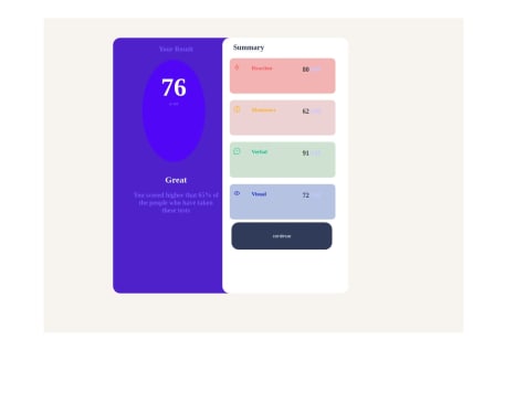
    I feel getting better at this but I don't know some stuff :

    • How to make it responsive ?
    • Is the circle part good enough? it's my first time doing it.

    Any feedbacks are welcome !!!

    @Tolulope-as

    Posted

    Nice effort!! To make it responsive you will need to use a media query,you will need to set a max width at which your container flex direction will change to column for mobile screens e.g

    @media screen and (max-width:600px){ .mycontainer { display: flex; flex-direction:column; } }

    This css code means at a screen width of 600px and below ur container's flex direction will no longer be row but column

    I advise u to watch a video on responsive design and Media queries.

    Marked as helpful

    0
  • @Quamsquama

    Submitted

    I actually don't find anything difficult , I'm a genius in every thing I do

    @Tolulope-as

    Posted

    Nice attempt 👍 But there is desperate need for improvement

    0