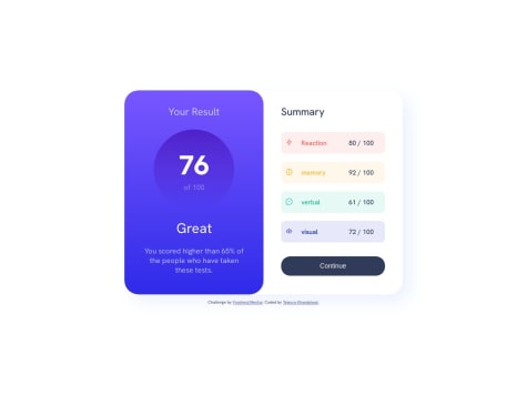
Just got stuck in media queries and shadows. I am a bit confused in media queries that somehow worked but i dont know how?
Toheeb
@Toheeb345All comments
- @tejasva-087Submitted over 1 year ago@Toheeb345Posted over 1 year ago
Hello, you are actually styling desktop first, so you will need to set your
max-widthfor the tablet size but you are indicating the maximum width to be the the size of mobile screen, you can change the max-width for your media query to this:@media (max-width: 768px) { }it is meant to work that way 👍
0 - @IsaacLezamaSubmitted over 1 year ago
I'd like some help with centering divs, I found kind of easy with the horizontal centering but it was difficult when I tried vertical. Any advice or comment about what I did would be really appreciated. Also sorry for my english in advanced, it's not my first language (:
@Toheeb345Posted over 1 year agoyou were using transform
transform: translate(-50%, 10%);The correct way to center a div using the positioning property is
transform: translate(-50%, -50%); ✔Try it out!!
1 - @faybasSubmitted over 1 year ago
- how do I get the numbers to stay clicked
- the page has excess space on the left on a phone. how can I fix that?
Thanks for all responses
@Toheeb345Posted over 1 year agoAn easy way you can do this is by giving an ID of the exact number for each of the buttons in the html file, then you store the ID in a variable to get the ID of the button clicked, and then you output the variable in the result part
Example:
<button id="1" class="rate">1<button >
<button class="btn">submit<button >
const btn = document.queryselector('.btn');
const rate= document.queryselector('.rate');
btn.addEventListener("click", ( ) => {
const rateValue = rate.id;
result.innerHTML =
${rateValue};});
That's just a demo code to show you what i was talking about, let me know if you got it!
2


