Fernando Simizu• 190
@fsimizu
Submitted
Looking to hire developers?
@Saqibytes
@fsimizu
Submitted
@Saqibytes
Posted
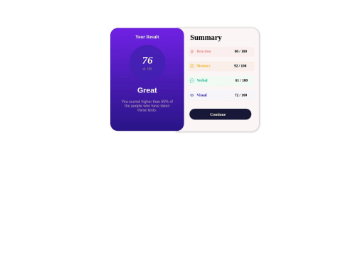
This is so nice and clean however, try using a single background box with shadow and add an other div box for the Blue result back.
Marked as helpful
@fahriTrh
Submitted
In this case, I used the Tailwind CSS framework for assistance. Hopefully, it's a good start.
@Saqibytes
Posted
Great work, Consider this practice as if you are delivering the project to client so you can be more accurate and perfect with the design. Moreover, It's suggested to use provided fonts from style guide file.
Marked as helpful
@sakshi0921-lab
Submitted
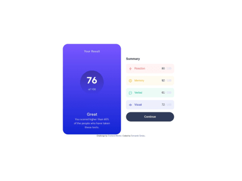
One of my biggest challenges involves finding the right design size for both desktop and mobile. I'm curious about how I can incorporate icons to represent words. Do you know where I can learn how to create those icons that were already included in the file for reaction memory, both verbal and visual?
@Saqibytes
Posted
Nice Work, Would prefer if you use the same fonts given in readme file for every user. Also consider using flex box, it's a great way to master the flexbox which will take less effort and minimize code.
Marked as helpful