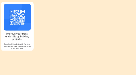
I finished the card component. However, I'm having trouble with responsiveness. I'd be glad to get any help.
Peter Samuel
@PeterSamuel2001All comments
- @WlmserickSubmitted about 1 year ago@PeterSamuel2001Posted about 1 year ago
You can use media queries to solve this issue. let me know if you need help with them.
Marked as helpful0 - @faveRiddimSubmitted about 1 year ago
Please i would love to know if there is a much better way to do this particular challenge.
@PeterSamuel2001Posted about 1 year agoLooks good, but you need to center it vertically.
I reviewed your code and I have some notes, you can use a landmark instead of using an id on generic divs, plus it's best practice to use classes instead of IDs in css.
I've done some edits and centered it for you.
https://github.com/PeterSamuel2001/QR-code-notes
Marked as helpful0 - @ImammikaSubmitted about 1 year ago
Centering the QR code
@PeterSamuel2001Posted about 1 year agoTo center it you can either use grid or flexbox or position absolute. Either would be fine but I encourage you to use the first 2, as the latter takes the element out of the work flow completely, so if you're doing it within a full fledged web page its position will need to be hard coded.
I reviewed your code and centered the element for you, here is my github repository that contains the new edited code: https://github.com/PeterSamuel2001/QR-code-centered-with-flex
A few things to note here, you need to have landmarks in your page. Landmarks are things like 'main' 'section' and it's best practice when it comes to writing html code.
Here's is what I used in my edit and why I used them. I used flexbox to center the div, in order to do that you first wrap it within a container, in our case it's 'main' and then use the following properties on the container:
display: flex;
You need to specify 'flex' as html elements default to 'block' if left unchanged.
align-items: center;
This specifies the Y-axis position. Keep in mind that this will not work out of box, you have to specify the section/page height in order to be able to vertically align elements as the height is set to auto by default and needs to be manually coded.
min-height: 100vh;
I said before that you need to set a section/page height, the problem with using the 'height' property is that it's hard coding the height which could be problematic in some scenarios. If you're using it on a section and you put a lot of elements within the section then they will either overlap or cover parts of the next section, so using min-height:100vh will allow you to vertically center it, but give you the flexibility you need when adding more elements under it.
justify-content: center;
This is another great property of flexbox and it centers the element horizontally.
Marked as helpful1 - @PeterSamuel2001Submitted about 1 year ago@PeterSamuel2001Posted about 1 year ago
This project took me a couple of days to put together because of the Javascript code but I'm proud of how it's come along.
0 - @IouieSubmitted about 1 year ago
Getting the right width of everything
@PeterSamuel2001Posted about 1 year agoI don't recommend that you use tailwind as a begginer. Take your time to learn css properly as tailwind is just classes written in html. It's not gonna teach you proper css in my opinion.
And reading the code was a nightmare for me, this is not a testimony to the quality of your code as it is a testimony of how messy tailwind is when you're reading someone else's code.
Edit: You should try to mimic the design as best as you can in my opinion.
Good luck!
1


