Not Found
Not Found
Not Found
Not Found
Not Found
Not Found
Not Found
Not Found
Not Found
Not Found
Not Found
Not Found
Not Found
Not Found
Not Found
Not Found
Not Found
Not Found
Not Found
Not Found

All comments

  • @catherineisonline

    Submitted

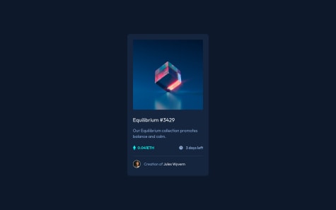
    Hello, Frontend Mentor community! This is my solution to the NFT preview card component.

    I have read all the feedback on this project and improved my code. Due to the fact that I published this project very long ago, I am no longer updating it and changing its status to Public Archive on my Github.

    You are free to download or use the code for reference in your projects, but I no longer update it or accept any feedback.

    Thank you

    Olli1989• 80

    @Olli1989

    Posted

    Hello,

    a hover transition would be nice, it would be much smoother.

    At the smallest size of the browser you have side scrolling.

    If you resize the browser you are jumping between sizes, thats because of your media querries.

    Besides these small things it looks great.

    I hope i could help.

    1
  • obasekiosa• 120

    @obasekiosa

    Submitted

    Is my observation (detailed below) wrong or is there something I am missing?

    Working on this I noticed when the size(height) of a flexbox element(flex-direction: column) is not set and you place padding on a child element that precedes an image sibling or a sibling with an image as a child, the way the image is rendered gets distorted. so It is best to add padding or margins on the image or image container directly.

    Olli1989• 80

    @Olli1989

    Posted

    Hello,

    By default, the children of a flex container are stretched. Use align-items: center and nothing should be disorted anymore.

    In your case you do not need flex-direction: column on your class order-info because everything is center anyways (you use text-align: center on your class card__order-summary.

    Hope this will help you!

    Marked as helpful

    0