

@Orekihotarou-kSubmitted over 1 year ago
What are you most proud of, and what would you do differently next time?
This is the second time I've done this particular challenge and I found the JS part of it so much easier than it at first.
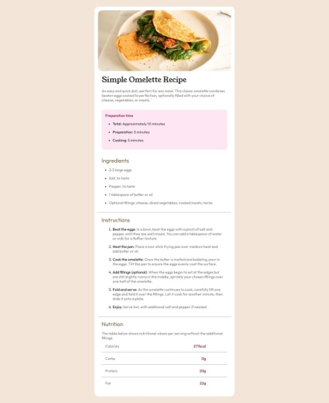
What challenges did you encounter, and how did you overcome them?I had an issue with getting the drawers image looking like it does in the design
What specific areas of your project would you like help with?I need help with getting the drawers image to look like it does in the design