Muhammad Mahmoud
@MuhammadM1998All comments
- @3okashaSubmitted almost 3 years ago@MuhammadM1998Posted almost 3 years ago
Use form instead of a div. Semantic HTML is always good. You should use labels with inputs, or aria-labels for sake of accessibility. Tip buttons should have a pointer cursor. I think the app should recalculate every time I select a different tip, no just when I change the number of people, even then I should leave the input field only then it calculates.
Try to add event listeners in the script files instead of calling the function in HTML.
Great Work, keep up!
1 - @catherineisonlineSubmitted almost 3 years ago
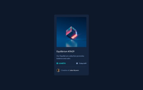
Hello, Frontend Mentor community! This is my solution to the NFT preview card component.
I have read all the feedback on this project and improved my code. Due to the fact that I published this project very long ago, I am no longer updating it and changing its status to Public Archive on my Github.
You are free to download or use the code for reference in your projects, but I no longer update it or accept any feedback.
Thank you
@MuhammadM1998Posted almost 3 years agoGood job catheriene. the container-details div need less margin-bottom and the overlay need to be a little lighter but it looks great. I noticed that your report has 0 issues and I always have issues such as the html should include the lang = "en" although I do have it in my code, I hope you can help me with this.
0

