Levan
@MosacdAll solutions
responsive post, HTML, CSS, JS
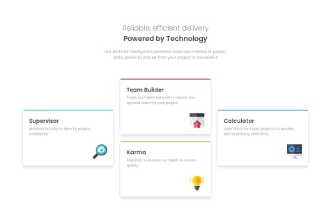
Submitted 7 months ago4)I would like to know how to make the picture look exactly like in the given examples. (do we change it with Css or just use a different picture/use some editor for it)
Responsive Blog page, HTML, CSS (Grid)
Submitted 7 months agoWhen it comes to using different units for text elements, when to use rem, em and percentages.
Responsive page for cards, utilizing Grid
Submitted 7 months agosetting minmax width/height when it comes to grid columns/rows seems a bit weird
Responsive, CSS, HTML
Submitted 8 months agoI have a little trouble on deciding where to set break points and I'm still wondering how responsive it is supposed to be. This version looks normal for desktop and intended phone version, but I don't like the way it looks on different types of screen sizes when it comes to phones and tablets (since they mostly have different size ratios and zoom). Writing media queries for each of these seems a bit excessive. (next Time I'll just try to fit it on tablet too I guess).
used HTML, CSS, responsive
Submitted 8 months agosvg is a bit more zoomed in in the mobile version, than the desktop version. I'm not exactly sure how to do that (manually changing width/height or something to do with resolution). Also am I supposed to make this thing responsive only for 375 and 1440 viewport widths or inbetween them too?
QR code task using HTML and CSS
Submitted 8 months agoI would like to learn how to make it responsive properly and how margin and padding effect responsivness.