Moises2710
@Moises2710All comments
- @BisshySubmitted 3 months ago@Moises2710Posted 2 months ago
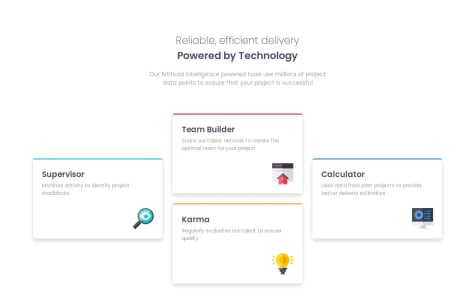
I like it because is more original that original design. I could do that but I did a design more like the original design. I like the first and the last box but I don't like much the 2 box in the left, there are have not a lot of text so It doesn't look very good but I like to see more solution like this.
0 - @MosacdSubmitted 3 months agoWhat are you most proud of, and what would you do differently next time?
Used grid for the first time, tried to make it more responsive than the previous tasks, started using rem,
What specific areas of your project would you like help with?setting minmax width/height when it comes to grid columns/rows seems a bit weird
@Moises2710Posted 3 months agoI don't remember much about this challenge but currently I feel that I could make to better.
0 - @yashpachauri1Submitted 3 months ago@Moises2710Posted 3 months ago
This challenge not include semantic HTML because I know a few about semantic HTML. This web page is accessible in topic like responsive design but not for disabilities people. The code is well-structured, readable but not reusable because I used a CSS classes with weird names. The solution don't differ considerably from the design, you can see a photo in git hub if you want.
1 - @Shoaib-Bin-RashidSubmitted 4 months ago@Moises2710Posted 4 months ago
I like this challenge because is simple but if you are a newbie this challenge can be difficult so you need study topics like HTML and CSS if you want to complete it.
1 - @konradbaczykSubmitted 4 months ago@Moises2710Posted 4 months ago
I start Frontent Mentor 5 or 4 month ago so I see how I improve a lot in my knowledge about web design, I just say that if you want you can do it.
1 - @matheussbacelarSubmitted 4 months ago@Moises2710Posted 4 months ago
I did this challenge 3 month ago and I don't remember a lot but I see I can be better in my next solution. I could be made the paragraph and the title above, also I will do better the code structured.
0 - @DevisBorgSubmitted 4 months agoWhat are you most proud of, and what would you do differently next time?
Create it in the best way I could think of. I don`t know what I could make different
What challenges did you encounter, and how did you overcome them?Making everything as similar as possible was challenging, but reading the code several times helped me understand better and overcome it.
What specific areas of your project would you like help with?I had a little difficulty at first thinking about how to create the code, and later creating the css
@Moises2710Posted 4 months agoI uploaded this challenge in March and now that I look at it I feel like it can be much better, especially thanks to the recommendations that you just gave me. I have improved and now I can see them better, I will upload the challenge with the same mistakes to be able to be better in the near future.
0


