@jcgoodwin86Submitted about 2 months ago
What are you most proud of, and what would you do differently next time?
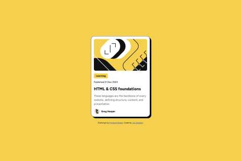
I didn't need a media query for the card size to make it responsive.

I didn't need a media query for the card size to make it responsive.
Instead of using fixed pixel sizes, you should use rem units to make your typography more responsive and easier to scale across devices. rem is based on the root font size (which is usually 16px by default in browsers). This approach makes it more adaptive to user settings and accessibility needs.
Your code looks well structured.