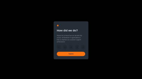
any review would be appreciated.
Mauro Gabriel dos Santos
@Maurog-rgbaAll comments
- @fhmtsdqSubmitted 9 months agoWhat specific areas of your project would you like help with?@Maurog-rgbaPosted 9 months ago
Hi, congrats on your solution, the design looks good! I have only one thing to say, I think it would be better to center de main div with flexbox, like:
.main-div {
   display: flex;
   justify-content: center;
   align-items: center;
}
Keep going solving new challenges! Good luck!
0 - @nrl-nabilanatasyaSubmitted 9 months agoWhat are you most proud of, and what would you do differently next time?
My first challenge here. I am kinda proud that I am able to replicate the design even though maybe not really close. I would love to try using other framework other than basic HTML and CSS.
What challenges did you encounter, and how did you overcome them?To match it as close as possible to the design is pretty hard, especially centering a div on the screen.
What specific areas of your project would you like help with?Any feedback that can help me improve would be great, especially on how to write clean code or how to make responsive website.
- @wolfgunbloodSubmitted over 1 year ago
Any Comments regarding the App ??
@Maurog-rgbaPosted over 1 year agoHello, congratulations on completing the challenge!
I just wanted to give you a quick tip that was also shared with me regarding the height of your container. Instead of using
height: 100vh, you can set it tomin-height: 100vhto accommodate different devices. This way, your container will adjust its height to fit the viewport.I hope this suggestion helps. Good luck in your next projects!
Marked as helpful0


