Enitan Elijah
@Mastermind390All comments
- @arturasmckwczSubmitted about 1 year ago
- @atnbnSubmitted over 1 year ago@Mastermind390Posted over 1 year ago
wow! wow!! wow!!!.
You really tried on this project and all I have to say is good job well done and you deserve every accolades you receive.
Well done ALTAN. Be proud of yourself.
The only improvement you need to work on now is your design and eye for details skills.
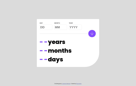
When I navigate to the website and try to interact with it I see so many resizing whenever a error occur, you can fix that next time to prevent bad ux experience for the user. Anything other than is a job well done.
0 - @KennethB09Submitted over 1 year ago
It's kind a messy but it's working!
@Mastermind390Posted over 1 year agoThis solution is great, I give it 9/10. The only thing I can point out that needs adjustment is the READ MORE button, you did not add a pointer cursor to indicate the button is clickable.
1 - @AziraalDevSubmitted over 1 year ago
Very beneficial for a newbie like me. I've learned a lot of useful things.
@Mastermind390Posted over 1 year agoThis is good, all I have I have to say to this is to keep up the good work.
Marked as helpful1


