MartinXCVI
@MartinXCVIAll comments
- @alexisshy@MartinXCVI
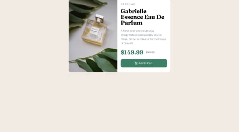
Hi! The card looks pretty good - I would suggest you to get used to applying the proper HTML semantic tags. Wrapping it all inside a <main> instead of a <div>, setting its height to 100vh, and centering your card by flexing its parent element. This will make it more comfortable for viewers to enjoy this project. I hope this helps you!
Marked as helpful - @pandjiaprillian@MartinXCVI
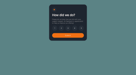
Hello! - It certainly looks good. Using "em" to round the buttons should be better than using percentages in order to make them perfectly spheric. Also do not forget to structure it with the proper semantic HTML tags. Wrap it all inside a <main>, set its height to 100vh, and use flex-box to align your container to the center of the screen. That will make it more comfortable for users to look at. I hope this helps!
Marked as helpful - @Meetkamal256@MartinXCVI
Hello Kamal; it looks good. Perhaps a way of improving it would be to round the buttons with "em" instead of using percentages so it looks perfectly spheric. Also being more specific with flex-box in order to fit the child element exactly in the middle of its parent element. There is a small space to the right which can be noticed if you pay close attention to it. I hope this helps!
Marked as helpful


