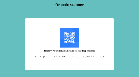
I found very difficult to center the image of Qr and its takes a lot of time to know that how to manage its border radius.
Manuel Lucero
@MalexLuceroAll comments
- @subodh1221Submitted over 2 years ago@MalexLuceroPosted over 2 years ago
Enclosing the image, title, and text into an article or div element will help. You can then center the article/div element without worrying about the image.
<article>
    <img src="yourImg.jpg" />
    <h1>card title</h1>
    <p>card text</p>
</article>
In the CSS, you could position the article element in the center by adding flex box to the body.
body {
    display: flex;
    flex-direction: column;
    justify-content: center;
   align-items: center;
}
css-tricks.com/snippets/css/a-guide-to-flexbox/ Here's my favorite guide on flexbox. :)
Keep it up!
0 - @pepepinguino69Submitted over 2 years ago
whats the best way of organizinbg classes within the code to make it more readable...
@MalexLuceroPosted over 2 years agoI really like the BEM (block element modifier) and Atomic Design methodologies where you attempt to name classes after the component. For example, I choose card, card__title, card__ image, and card__content as my class names of the elements that form the card. Here's a great resource https://en.bem.info/methodology/quick-start/. There are also really good youtube videos on Atmoic Design. https://www.youtube.com/watch?v=W-h1FtNYim4
Marked as helpful0

