Malarpit16
@Malarpit16All comments
- @khanwelcomesSubmitted about 2 months ago@Malarpit16Posted about 2 months ago
It looks like you had trouble recreating the nutrition section. This can be done using a table and giving the <td> elements a border-bottom style. Here is a link showing you how to do this. Just scroll down a little. https://www.w3schools.com/html/html_table_styling.asp
Marked as helpful0 - @tassistaSubmitted about 2 months ago@Malarpit16Posted about 2 months ago
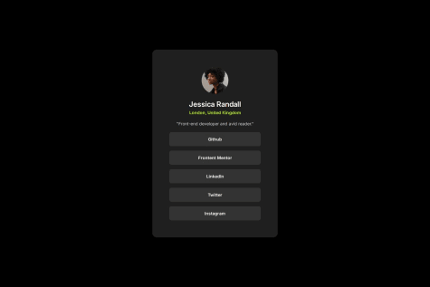
Instead of using a whole bunch of divs with anchor tags inside you should use an unordered list ( ul ) with list items containing the anchor tags. Then you can use css to style it. This is how most navigation is done such as a navigation bar at the top or side of a website. It would look something like this:
<ul> <li><a href="#"> Github </a></li> <li><a href="#"> Frontend Mentor </a></li> <li><a href="#"> Linkedin </a></li> </ul>Marked as helpful0 - @abiyyuaqzalSubmitted 2 months ago@Malarpit16Posted 2 months ago
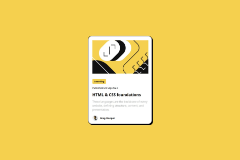
Looks Good! I would add some padding to the bottom of the paragraph because it looks a little strange touching the picture of Greg Hooper. Besides that you did amazing.
Marked as helpful0 - @Obasola-EmmanuelSubmitted 2 months agoWhat challenges did you encounter, and how did you overcome them?
Noticed I forgot how to center a div and had to use margin top and bottom to do so.
What specific areas of your project would you like help with?How to center contents using justify-content and align-items
@Malarpit16Posted 2 months agoTry using justify-content and align-items on your "container" div to center the QR Code component in the center of the page.
Marked as helpful0


